In July of 2007, ERA404 was approached by Robert Lovenheim, the founder of MovieBamba, to discuss a problem. As we relaxed over iced coffees in the brightly-lit, air-conditioned Starbucks by the Hoboken PATH train, he voiced his concern: The idea of the site is good, he said, but all the design keeps getting in the way.
And he had a pretty good point too. The site focused on creating small pockets of communities in urban areas for people to be introduced to foreign films, learn more about them, and ultimately see them together. The core of MovieBamba was a social network focused on movie fans. This original idea brought to life the possibilities for online dating, meet-ups, culture vulturing, original/online information sources, eCeleb generation (reviewers) and a host of other features that had never been attempted before. As complex as that sounds, he said, it’s really just a site for movie fans.
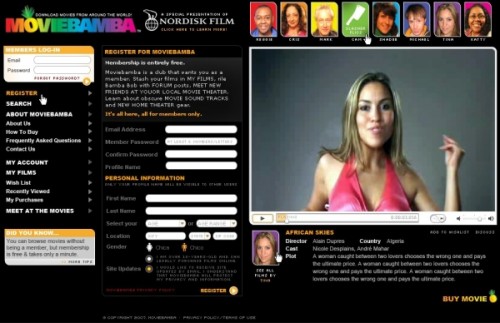
But the design really was getting in the way. The initial developers had created the whole site in Flash so that each section incorporated animation and movement. In theory, it emulated the motion picture. In practice, it made the site a heavy load and a clunky interface. Prior to the Google paradigm—during the era of Balthaser Studios and 2Advanced—surfers used to have patience for the then-new snap, crackle and pop of Flash. As the browser became tabbed and the surfer was presented with dime-a-dozen duplicates of these sites, they became impatient and finicky. I myself will control-click down a list of search results, popping open fitting results in different tabs, and browse them quickly with my cursor over the “close tab” icon. God forbid your site was the first tab opened and a slow-loader at that. You were gone before your message read “Site Loaded”.
So speed has become a primary concern. And video sites like YouTube and Google Video realised it quickly. With the exception of the video itself, the wrapper is wafer thin. CSS for YouTube is only a couple hundred lines long. Seriously: Load the page and cover the video with your hand and you might as well be looking at Craigslist.
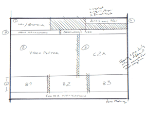
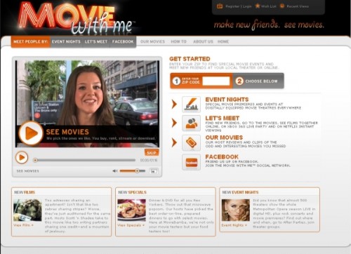
 The next step in our proposal was direction. As Robert mentioned, the site was a very simple concept. But the number of avenues he presented his user were great. Imagine the Griswald family stuck in the rotary (“Look, kids, there’s Big Ben”). If your starting line diverges into too many directions, people have a hard time leaving the gate. The concensus was to take a page out of the social networking (Face) book, and literally spell out the directions on the home page. This way, if a user didn’t have the time or patience to watch the pretty girl in the introductory video, they could read the <h1>s and follow the numerated, two-step process.
Following the discussion of speed and direction, Robert fell silent for a moment, and looked out the window to Hoboken’s bustling River St. This is going to be a longer process than I thought, he said to no one in particular. And, instead of getting frustrated, setting a rigid deadline, or pinching the purse strings—as is the customary reaction to news like this—he said the most wonderful phrase a designer could wish to hear:
“As long as we’re making these changes, what else would you do to make the site better?”
Friends, remember this one thing: the only thing a good designer can do more than listen to a critique is express an opinion.
That week, the team had amassed a sizeable checklist of recommendations, some of which were:
- Rebranding effort to create a new visual identity that focused on social networking over international appeal.
- Split and re-prioritize navigation:
- Main Navigation for top destinations
- Barkers ( sometimes referred to as “call-outs”) for secondary destinations.
- Footer Navigation for tertiary/auxiliary links.
- Incorporate Permalinks and Folksonomy for SEO.
- Reorganize content based on accessibility.
- Refine color palette to reserve accent colors for action items.
The list went on for a few pages. Robert put on his glasses and went through each item asking questions here and nodding there. When he had finished reading it, he looked up and smiled: when do we get started.
It wasn’t until a few months into the project (now called “Movie With Me”) that I made a strange realization: our entire discussion and list—with the possible exception of the rebranding effort—did not include one design suggestion. In fact, aesthetic was almost completely excluded from discussions we’d had from day one. And perhaps, if Robert had approached us with the problem of “How do I make my site look cooler?” or “How can I attract a younger audience?” our responses would’ve leaned toward the world of design. But, in actuality, all our efforts were focused on usability.
Revisiting each item on the list of services in our agreement with Robert, I found it puzzling how this slipped through my fingers. My own degree is a Bachelor of Science in Visual Communication. My courses trained me in color theory, typography, focal points, grid/layout, photography and other visual elements. Though most of my colleagues in employment held a Bachelor of Arts, my design degree was firmly rooted in the College of Business and nestled nicely among a smattering of marketing, management and business classes.
It’s mildly comical to think that nearly 10-years after I graduated, I’ve finally understood the difference between my Visual Communication degree and a simple Graphic Design degree: focus. While the outcome may be remarkably similar, the road to getting there is vastly different. A designer will attack a concept based on visual stimuli, aesthetics, convention, trends, personal tastes and theory. A visual communication will approach it based on focus testing, market research, experience, competition strengths and failures, slant industries or co-opetition, logic, usage processes and testing. In our effort to make the site more usable, we made the site more aesthetically-pleasing.

Fig 01 (Above): Original MovieBamba Design

Fig 02 (Above): Redesigned “Movie with Me” design
I’m actually stunned that it took me this long to realize the difference between the way I work and the way most other designers that I’ve met work. My college mates, whom I pester from time to time for critiques, have always provided feedback based on how a design communicates (usability begets design). My vocational friends have provided responses based on emotional reactions (aesthetic begets design). And this balance has helped me to teeter happily in the ovoid heart of the design-visual communication Venn diagram.