
A few years back, I worked with Brooklyn-based entrepreneur, Adam Goldstein, to help design his wine labels for Brooklyn Wine Company’s Feliz Red, White and Grand Army Meritage. I don’t have to tell you how challenging, exciting and gratifying designing packaging can be—particularly for wine labels. And, as I celebrate my 10-year anniversary in New York City, it was especially gratifying to be recognized by HOW Magazine in their “Behind the Design” column for the work we designed for my adopted home.
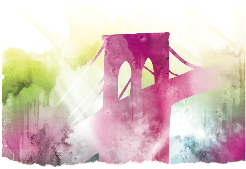
I’m proud to be working with Mr. Goldstein again to create the labels for his sparkling wine. Above are two rough water color renderings bearing a different spin on the initial concept (described here). Both pieces incorporate a reinterpretation of the iconic bridge artwork, originally created by Brooklyn-based artist, Ryan Seslow.
Preliminary reactions by the client as well as designers in the ERA404 network and community have been positive, but mixed. The reversed version (top) showcases a more subtle bridge with the focus on the sunsets behind it, thus creating a stronger tie to Roebling’s concept. The second version brings the bridge back into the foreground, making it more recognizable/distinguishable from across a room. At this point, I’m trying to figure out which is more important: concept or customer recognition. I think both have merit as they each accomplish both of these goals, but we have yet to make a decision on the matter.