


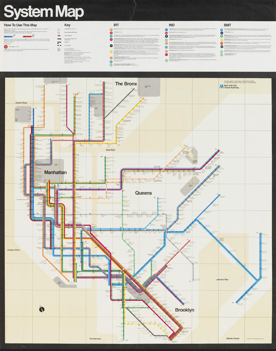
New York City’s subway system has a new map with a very old design concept, inspired by Massimo Vignelli‘s 1972 classic.
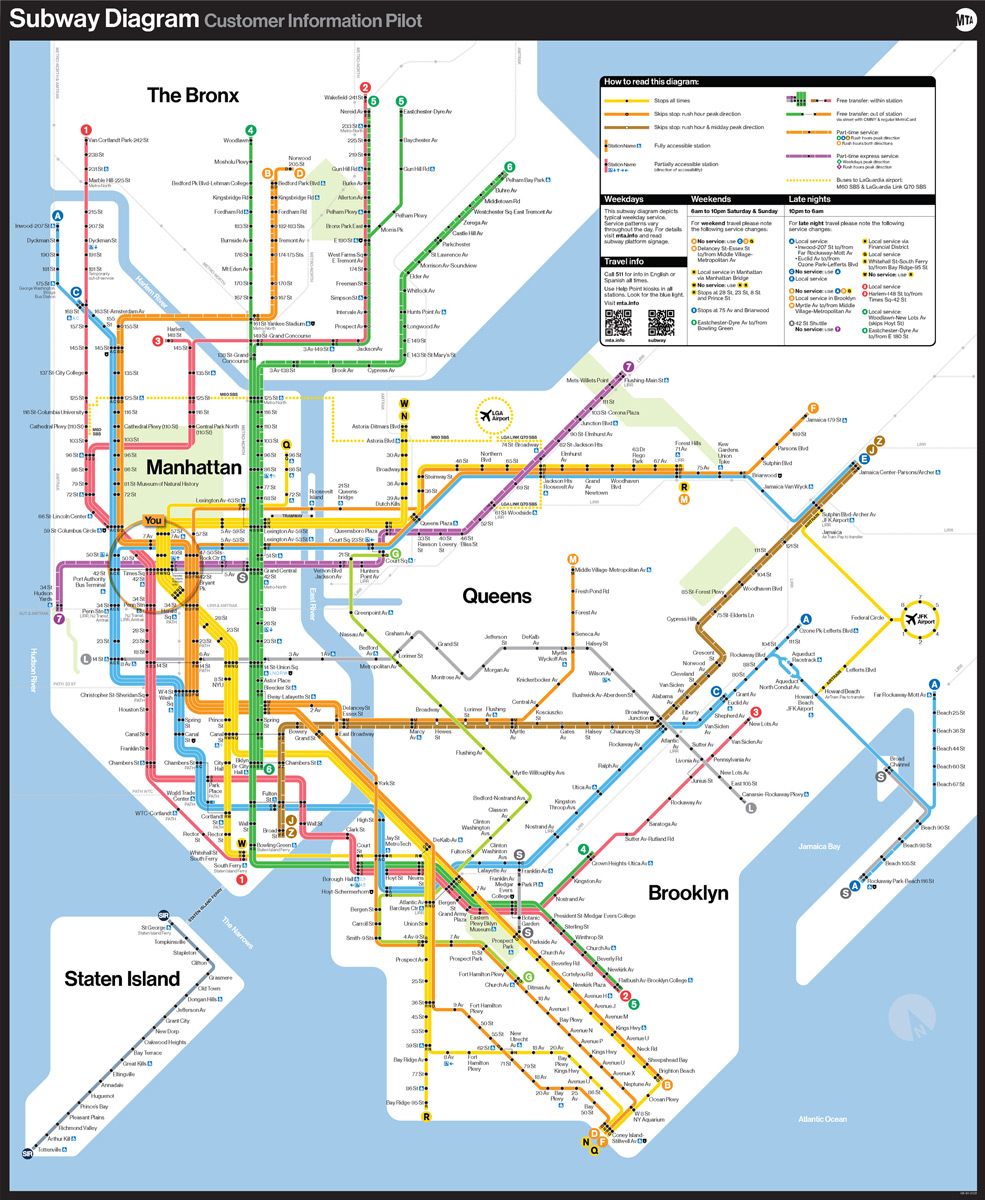
Rolling out in a handful of stations across the city, a pilot version of the Metropolitan Transportation Authority (MTA) subway map features an abstract version of the city, overlaid with bold lines marking each route. It’s an attempt to clarify where each line goes and how they connect at stations.
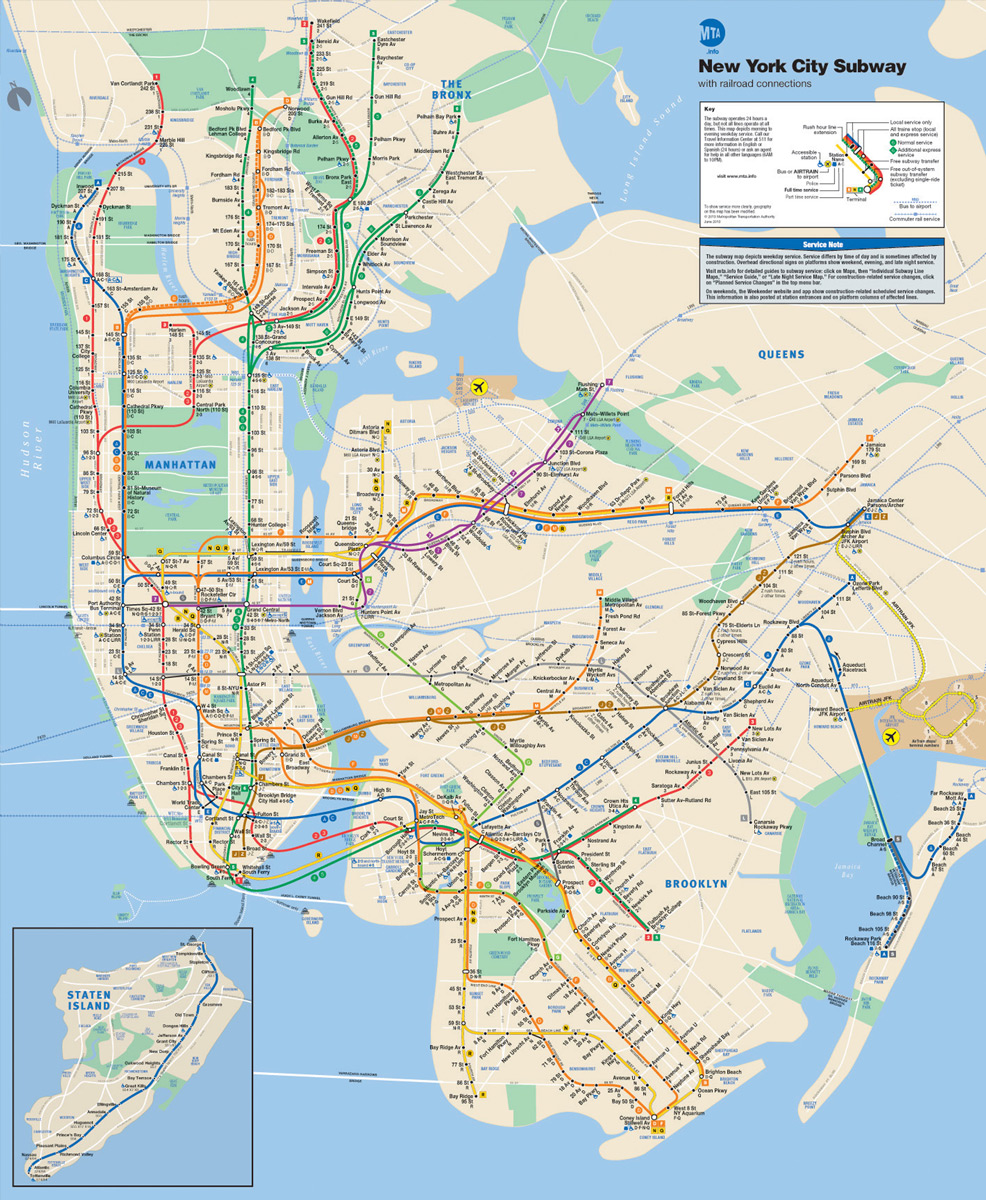
The printed map, now being tested on the walls of nine subway stations, is an updated version of a 1970s-era map that has become a classic example of informational design. The new map simplifies the shape of the city, and the precise location of subway lines, to give riders an easily comprehensible overview of the system, showing which lines connect and how to get across boroughs or into different neighborhoods.
Read more on FastCompany