 When Adam Goldstein approached ERA404 about designing labels for his new wine company, Brooklyn Wine Company, I have to admit I was pretty excited. If given a chance, I’d drink a beer over wine anyday, but I do really enjoy red wine. I, as with most uncultured palates, nearly always select a wine for its label rather than what I should’ve read in a Wine Connoisseur periodical. Even after having gone on a tour of Taittinger’s operation in Reims, France, a few years back, I just haven’t learned (or cared to learn) how to select a wine based on varietal, region or manufacturer. I think my stubbornness comes from the misconception that a cultured palate comes with an expensive taste…and I’m just not willing to part with money that easily.
Adam, as with all great thinkers, has a pretty great view of how a wine label should be designed. When we started putting together his wine shop (Red White and Bubbly) site, we gave him the design for a wine shop. He absolutely loved and hated it. “What you’ve given me is a wine shop site,” he said. “And while it’s perfect, it’s not what I’m looking for.” “But it is a wine shop,” I replied. “Yes and no. I’m not selling wine, exclusively,” he said. “I’m promoting the idea, the spirit and vibe of Brooklyn.”
This is his entire approach for the idea of the wine labels too. “Did you know,” he said, “that when Roebling designed the Brooklyn Bridge, he knew it couldn’t compete with the ever-changing skyline of Manhattan. So he decided to build it to emulate the arched stained-glass windows of a church. This way, the bridge itself would become a backdrop for some of the most unforgettable skies imaginable. The Bridge was a picture frame for an even greater marvel.”
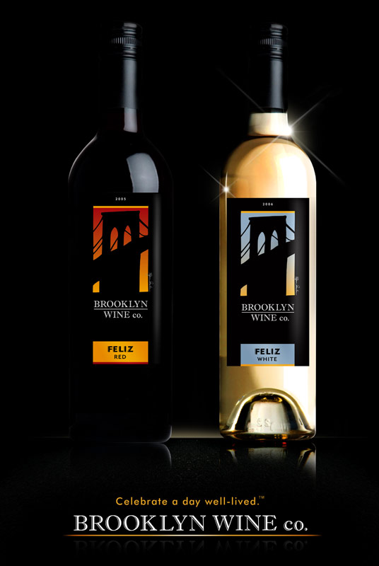
This created the foundation for my ideas for the wine label. Working together with Ryan Seslow, a Brooklyn-artist, we created the idea of a block-print view of the Brooklyn Bridge arch where the main color of the label would emulate the picturesque skies, signature of a view from Brooklyn. The buildings of Manhattan’s skyline are absent because we still wanted to maintain the BWC brand as Brooklyn, not NYC.
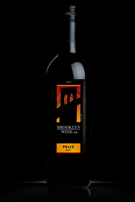 For Feliz Red, one of the two inaugural varieties of the coming eight wines, we chose a warmer palette…similar to the skies of Summer. Wine drinkers tend to choose reds when they’re eating red meat, and commonly prefer it in Winter because it’s not served chilled. The warmer palette accents the idea of a warmer ideal and draws Winter drinkers closer. More importantly, though, the colors matched the feel and taste of the wine–warm, ripe and a bit smoky. In fact, here’s what the creator had to say about the flavor:
This is good wine. Not fancy wine. Not “chemistry set” wine, created by adding a pinch of this, a drop of that in an effort to get a high rating from wine critics. This is wine to drink and to enjoy…to celebrate a day well-lived. This is wine that tastes like you paid more for it than you did; wine that will make you glad that you poured yourself a glass. The color is deep, dark purple/red. Take your first sip and you’ll discover smooth, rich flavors of raspberries, black plums, chocolate, cinnamon and an earthly note. The flavors linger on your tongue: warm, ripe and a bit smoky. We worked closely with our good friend, winemaker Clark Smith, to create this blend to charm you and delight you, and I do believe we got it right.
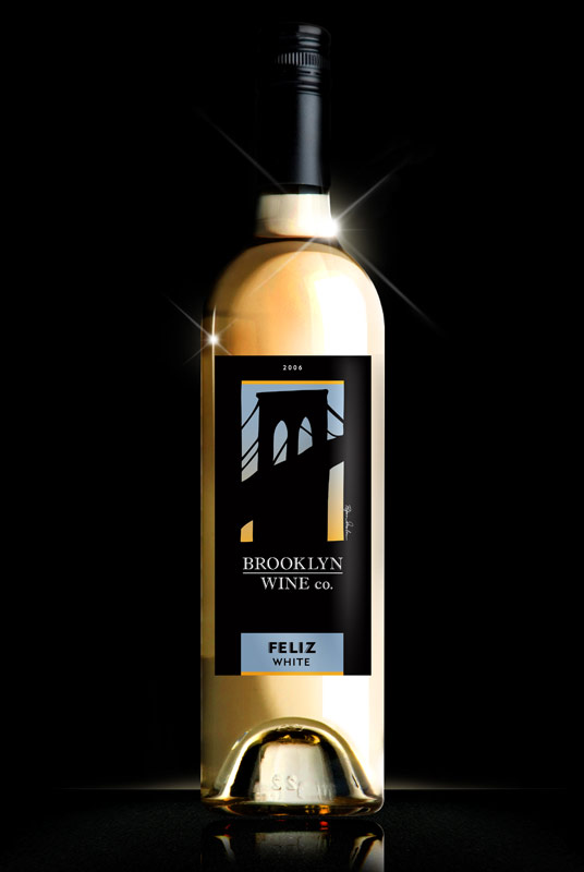 I chose to envelope the theme for the Feliz White, BWC’s second inaugural wine, by choosing the opposite approach. The wine was crisper and chilled. It’s cooler and meant for different foods, different consumption and different weather. Rather than including more whites, I tied together the common accent of the gold with a dull, grey blue to emulate a sunrise (over the Feliz Red’s sunset). After experimenting with hundreds of shades, I think the label itself embodies the visual identity of the flavor of the wine, again, reproduced below:
When someone once asked for my philosophy of wine, I answered: “There’s everyday wine, Sunday dinner wine and special occasion wine.” She laughed and said: “You have a very practical philosophy.” I took that as a compliment. This is a wine priced for everyday drinking that tastes special enough to be your Sunday dinner wine. You’ll smile when you take your first sip and find your palate filling up with bright, lively fruit flavors; crisp lemony acidity and a smooth, long finish that just goes on and on. This is a wine to drink simply because on most days the sun shines and life is good. This is a wine to pour for your friends because they are your friends. We worked closely with our good friend, winemaker Clark Smith, to create this blend to charm you and delight you, and I do believe we got it right.
Both labels use the same block print and carry similar mysterous (Gotham-like) color palettes. The signature design is meant to fade in with the red bottle and meld in color with the white bottle. The reverse labels, which were designed by a wine manufacturing design company, pulled from my design in palette, layout and form.
The result, as friends, designers and Red White and Bubbly customers have all stated, is exactly what we’d wanted: an alluring label, indicative of the wines, that stands out on the shelves and shouts to the Manhattan skyline “We are Brooklyn.”
There’s a 30-foot billboard in Park Slope bearing the likeness of this work—the largest piece I’ve ever produced, with the exception of the Target Holiday Boat that floated in Chelsea Piers a few years back. At the wine-tasting today, there will be 2′ x 3′ posters of the individual bottles, labels, billboard and Web site design motif. I’m real pleased with the way this project came out and, more importantly, the client came back to me and let out a sigh, saying “Finally, Don, you understand what I’m trying to do. They’re perfect.”
I remember seeing a t-shirt of you Brooklyn Bridge logo in the Red White and Bubbly store. They appear to be out of it. I would like to purchase one as a gift. Any chance I could get one from you in a Large? Many thanks,
Unfortunately, i never got any of those shirts. You can try the contact form on the brooklynwinecompany.net site. Or visit Red, White & Bubbly on Union & Fifth in Brooklyn.
Good day. I wish to say that I like your web site. I’ve just determined it this past week and have been reading it constantly since then. Thank you for the fantastic web site and I hope you preserve the excellent work. If you do, I will carry on to read it.
Have a very great evening.
That’s a great entry, thanks for posting it. I’ve bookmarked your website and will look forward to reading more!