Project Comet

Project Comet

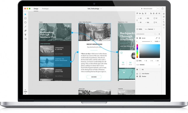
Adobe’s Project Comet, coming in 2016, promises to let us design and prototype websites and mobile apps with the same tool.

More than just allowing for interactive prototypes—which we’ve done with Invision—it also provides functionality to let us update the design (seamlessly with Photoshop and Illustrator) without losing any changes to the prototype, and touts lightning-fast performance with intuitive layout tools.

Read more

Pantone Moods Trends

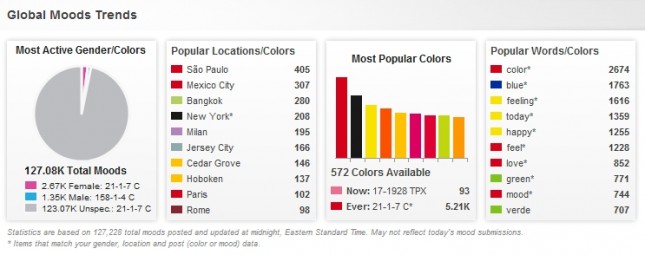
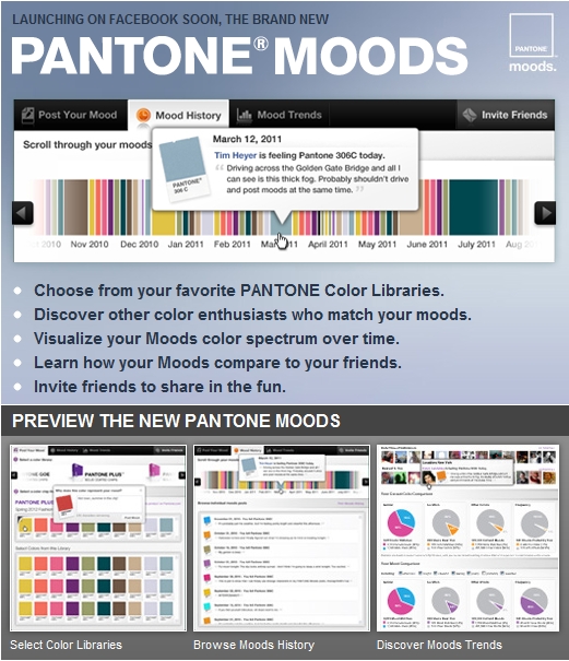
As part of the newly launched Pantone Moods Facebook application, the world-renowned color gurus asked us how we could make the social phenomenon (a quarter million moods have been posted, to date) more exciting for users. Color enthusiasts have had the ability to share their emotions and tag them with Pantone color chip values for the past three years. However, in addition to tripling the color selections (Pantone GOE, and, now, Pantone Plus and Fashion + Home libraries) and and interacting with other members, mood-posters now have the ability to share their gender and location information with the world of users online. In league with OKCupid Trends and Mint Data, Pantone Moods users can see who has posted similar moods and color chips. They can even filter down by Facebook location, gender and time of post to see whose emotional spectrum is the closest to their own.  Read more

Seven Questions to Ask When Designing the Feel of Your Mobile App

Feel Can Make or Break a Product
Imagine you are shopping for a new car. You found a model that looks great and has all the features you want. It’s even in your price range. So you go to the dealer and take a test drive. After about five minutes of driving, you find you are mildly dissatisfied with the car. Perhaps it’s the way it takes the bumps. Perhaps it’s difficult to check your blind spot. Perhaps the pedals and buttons are not responsive. Do you buy the car anyway? After all, you like the look, it’s a good buy and it’s got the features you want. Odds are though you are not going to buy it. Why? Because you don’t like the feel of it, and the majority of your experience with a car is tied to the feel.

Feel Plays a Key role in Mobile App Satisfaction
Since mobile devices are held in our hands and operated with touch, the feel of the experience becomes a key determinant of user satisfaction. Also, since the screens are small, more interaction is generally required than on desktop devices. So we experience the nuances of the feel again and again as we use an app. Mild annoyances can add up, let alone major ones. Conversely, a good feel will create an ongoing sense of ease and comfort. This makes it more likely the app will be used repeatedly, bubble up on users’ favorites list, be talked about and recommended to others.

Seven Questions to Ask When Designing the Feel of Your App
So are you ready to optimize the feel of your mobile app? To help, here is a list of questions worth asking when designing a mobile app to make sure you have addressed the feel:

  1.  Have you anticipated how the user will hold the device?
  2. Have you designed for operation using fingers, thumbs or a combination of the two?
  3. Have you eliminated undesirable “eclipsing” effects, that is, uncomfortable blind spots where the finger obscures what is being touched in such a way that the interaction is awkward
  4. On screens with a dense amount of content, have you kept the structure of the layout and interactions simple?
  5. Have you used an intuitive sequence of gestures to perform core tasks?
  6. Have you minimized user effort to see, locate and interact with elements on the screen?
  7. Have you asked someone (or several people) to try a prototype of your app on an actual device?

Check your design against the above items, and you will find the improvements you make to the feel of your app to be well worth the effort.

Original post: Bob Moll, Pathfinder Software

Lettercase

lettercase

In light of the creation of [d]online, the font, and my recent post about The League of Moveable Type (to which [d]online was submitted), I did some poking around and found their new Social Font Manager, the Lettercase Application. Apparently, this application will enable like-minded typographers to collaboratively build typefaces. And, to this typophile and amateur typographer, with marginal ligature skills and a lack of patience for kerning, this is wonderful news.

myPANTONE for the iPhone

screenshot01

I don’t have an iPhone. And if you know anything about me, you probably know that I would never really want one. I’m on my phone too much as it is and can’t imagine creating a situation where I’d want to be on it more. I’m happy with my HTC TouchPro (though I wish it had a longer battery life) and find 99.9% of the applications that I’ve seen on the iPhone to be worthless; along with the animations, bells & whistles of the phone itself.

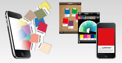
However, that said, I really find the myPANTONE app to be incredible. Take a look at this list of features:

Get your color inspiration and create your color scheme from these PANTONE color system libraries:

  • PANTONE MATCHING SYSTEM® (coated, uncoated and matte)
  • PANTONE Goe™ (coated and uncoated)
  • PANTONE Pastels (coated and uncoated)
  • PANTONE FASHION + HOME (paper and cotton)
  • Includes sRGB, HTML and L*a*b* for all colors

You can capture and extract colors from photos and snap to the closest PANTONE Color:

  • Images loaded on your iPhone
  • Directly from images taken by your iPhone camera

Automatically generates harmonious color combinations

Cross-reference PANTONE colors to other PANTONE color libraries

Once you have created your color palettes you can then share them in a variety of ways:

  • E-mail an HTML image of your palette
  • E-mail color palettes that can be used in the Adobe® Creative Suite® (.ase files), QuarkXPress® and CorelDraw®
  • Upload to the myPANTONE.com palette sharing web site

Other features include:

  • Text and voice annotation of palettes
  • Post notifications of new palettes to Twitter and Facebook
  • GPS tagging of palettes

There’s a video tour by Glenn Fleischman on YouTube and Pantone.com. And I imagine each new version will allow designers to perform more useful and intuitive tasks. And I’m not just saying this because we built the Facebook app, either.

The only other application that I would consider to be as helpful, if my meager testing of it proved it even worked, would be the What The Font app by MyFonts.com. I don’t know if it’s the iPhone’s crappy camera or the application’s poor calibration—the application on their site also seems lacking as of late—but I couldn’t get it to suggest fonts even mildly similar to the one I was seeking.