
Citarella Gothic Bold
Citarella Gothic Bold

Citarella Gothic Bold
The third weight of the Citarella Gothic family is now available on MyFonts.
The third weight of the Citarella Gothic family is now available on MyFonts.
I’m happy to announce that Citarella Gothic Ultralight is officially on-sale at MyFonts. Here’s the description:
About Citarella Gothic:
In seeking a strong, utilitarian gothic alternative for Helvetica, we’re left with few options for unobtrusive functionalism. As such, I decided to create the Citarella Gothic family. The ligatures are characteristic of the signage and architecture around Sarno, Italy, where the Citarella family originates. The sweeping arcs, broad counters, and clean swashes allow for the architectural design to be imbued with the warmth and humanity of its namesake.
Over time, I hope to extend the family to other weights and styles, but decided to start with the ultralight version and work my way through black. In the meantime, visit MyFonts.com to play around with the font. Your feedback is appreciated, as is, of course, your patronage.
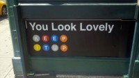
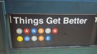
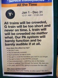
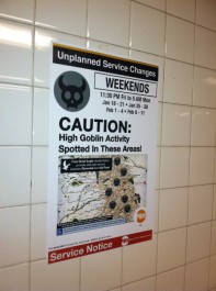
Subway Art Blog has a wonderful collection of fake, manipulated, and humorous subway signs and posters, curated by Jowy Romano. Some of these are really clever.
Warning: Bad Puns Ahead

Read this sign—posted on Washington and 1st, here in Hoboken—and tell me if you see any issues with it. Imagine being a foreigner to the United States who has never seen this sign before. Imagine being someone that doesn’t speak English as a primary language, like so many tourists and visitors to New York. Read more
After just having returned from a month researching my family in Italy (we were able to trace our family back to 1200 when previously we couldn’t get past 1860), I noticed the prevalence of the green man over The States’ preference for the red word “Exit”. But I also saw a number of signs that I felt were funny. Here’s one for the “waiting area” of an airport. In a place where iconography is especially important due to so many international speakers around, I initially thought this was a sign for the bathroom.
