Turns out Michael Mann, the Director of ‘Public Enemies’, is a control freak perfectionist in every area of crafting a movie….. that’s a compliment by the way.
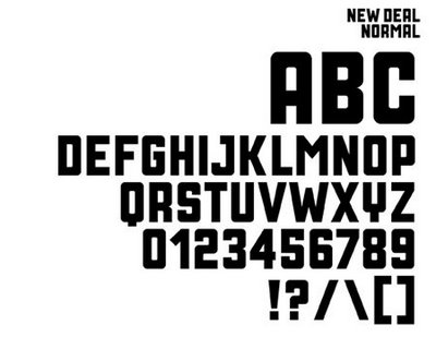
To get the type face of the title just right, Mann commissioned a special font from Neville Brody who says:
“Michael Mann understands the power of a good title sequence and always commissions his own. For Public Enemies, he wanted a font that evoked the Depression era, so I got inspiration from publicity posters for Roosevelt’s New Deal initiative. “