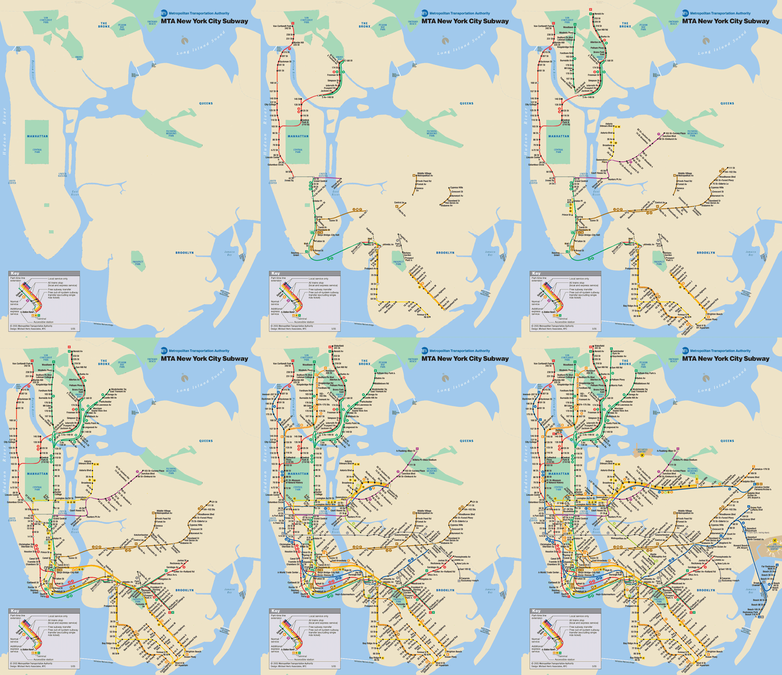
Here’s a link to an animated map that shows the growth of the NYC subway over time, from Appealing Industries Appealing Industries (via Spacing Toronto). Unfortunately there’s no time legend, which would have seemed like a no-brainer to include. Still a very interesting animation, though. And if you want to see about eleventy billion more maps from throughout the history of the NYC subway, go here.
Found on The Map Scroll
