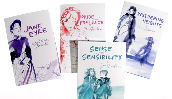
Teenagers are still reading the classics. They just don’t want them to look so, well, classic. That is the theory of publishers who are wrapping books like “Emma” and “Jane Eyre” in new covers: provocative, modern jackets in bold shades of scarlet and lime green that are explicitly aimed at teenagers raised on “Twilight” and “The Hunger Games.” The new versions are cutting edge replacements for the traditional (read: stuffy, boring) covers that have been a trademark of the classics for decades, those familiar, dour depictions of women wearing frilly clothing. In their place are images like the one of Romeo in stubble and a tight white tank top on a new Penguin edition of “Romeo and Juliet.”
penguin
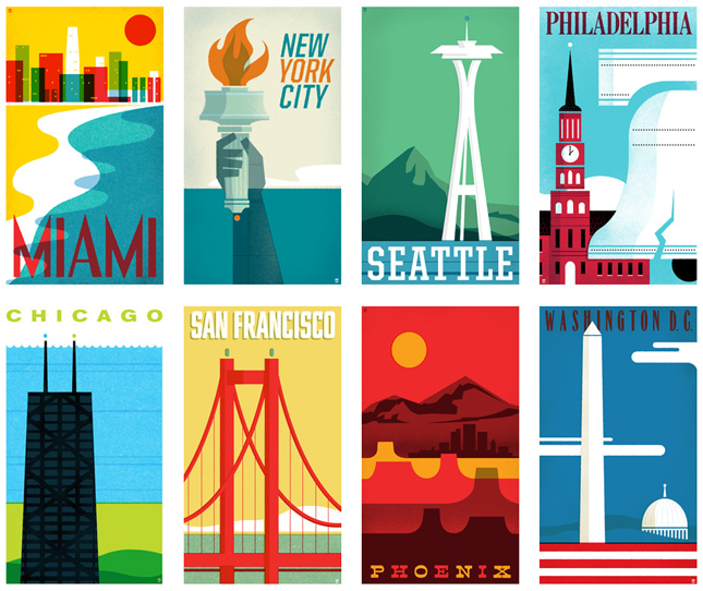
From Sea to Shining Sea
The Heads of State, the design and illustration studio of Jason Kernevich and Dustin Summers, put together this wonderful collection of travel posters. Each limited edition screenprint is 14 x 24 and, to me, more reminiscent of the old Penguin book covers than to traditional travel stamps. Regardless, I love them.
