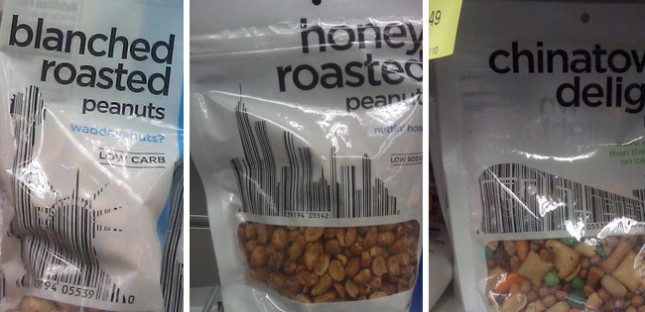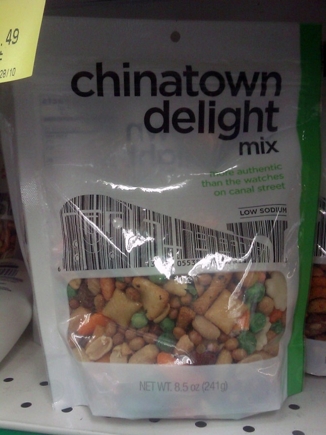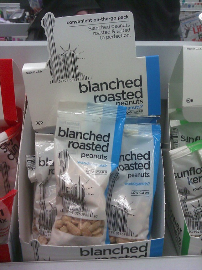
It isn’t the first time people have incorporated bar codes into the design of things. In fact, I believe I saw three different periodical covers last year that used this same technique. So the concept is far from original.
But Duane Reade—which, to New Yorkers, is synonymous with pharmacy—recently took this one step further by working their product bar codes into iconic metropolitan imagery. The Chinatown Delight—which I always thought was either a extra surprise at the end of a massage, or the revelation that she’s both my daughter and my sister (Don’t get my reference? Then forget it, Jake, it’s Chinatown)—uses a subway train. The Honey Roasted Peanuts uses a NYC cityscape. The Blanched Roasted Peanuts uses the Statue of Liberty. So while the imagery and concept are New York at it’s tritest, the integration of both the bar code and symbolism into the main graphic elements on this packaging makes it pretty unique and beautiful.
The monochromatic color palette and simple sans-serif typography are indicative of generic product packaging. However, they’ve warmed the designs a little—much like Paul Mitchell packaging, which recently added a splash of color to their product line—to merely imply generic, while still retaining an elegant design. They’ve even resisted using Helvetica for a softer font that looks to me like Colophon 60 Semi-Bold (Typist, a little help here?).
While the complete store and product redesign, incited by Walgreens recent purchase of Duane Reade, has led to the collective groaning of many New Yorkers, I admit I’m a big fan of the creativity and design that came from it.


Special thanks to Mike for taking the pictures.
Font identified, thanks to Rand:
http://www.linotype.com/90672/avenirnext-family.html?subviewmode=FONTS&samplestr=Chinatown+Delight