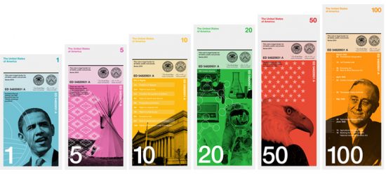
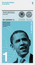
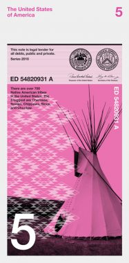
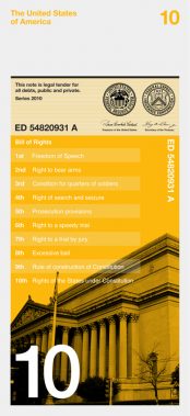
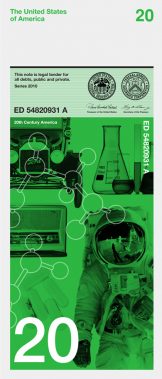
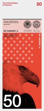
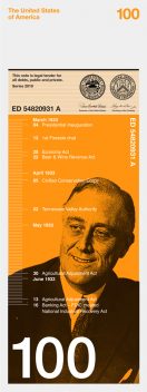
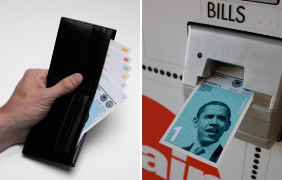
With their vertical format bills, Dowling Duncan have reignited interest in The Dollar Redesign Project. The following description is from Dowling Duncan: Read more
redesign
ERA404 Rebranding
You may’ve noticed a new logo up there in the right corner of [d]online. To celebrate 10 years since I created my studio, era404 Creative Group, and because my stationery was finally running out, we felt it was time to update our brand.
 Over the last decade, era404 has truly transformed from a design and development shop to one that provides comprehensive, strategic campaigns. Our best projects—the most rewarding and enjoyable ones—have spawned from relationships with clients that have fully embraced our nature as an ideas company. This is to say that when clients approach us with ideas, they hire us for more than just implementation. Rather, we’ve been privileged to be involved from Day One concepting through the complete process of strategy, design, development and continued maintenance of their campaigns. With these projects, we’ve had the pleasure of not only participating in the growth of their ideas and bringing them to life, but helping shape them with our knowledge and experience in the industry. Read more
Base’s New NASA Logo
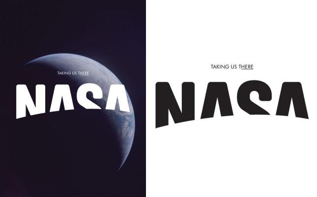
If you could redesign any brand, which would it be? This was the question asked of Base, a Brussels-based design firm, recently by Viewpoint magazine, The Future Laboratory’s bi-annual magazine about trends, brands, futures, and market strategies. Read their blog post, here.
Duane Reade’s New York Packaging
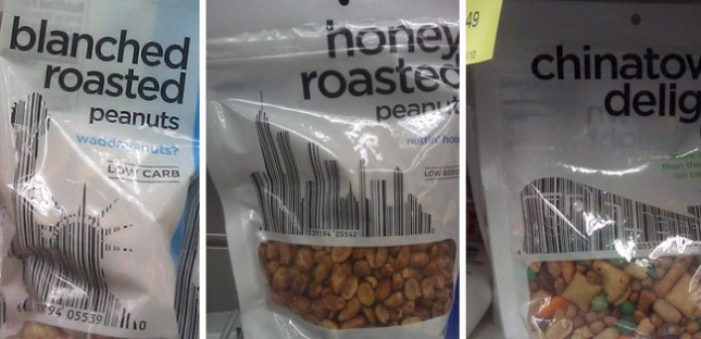
It isn’t the first time people have incorporated bar codes into the design of things. In fact, I believe I saw three different periodical covers last year that used this same technique. So the concept is far from original.
But Duane Reade—which, to New Yorkers, is synonymous with pharmacy—recently took this one step further by working their product bar codes into iconic metropolitan imagery. The Chinatown Delight—which I always thought was either a extra surprise at the end of a massage, or the revelation that she’s both my daughter and my sister (Don’t get my reference? Then forget it, Jake, it’s Chinatown)—uses a subway train. The Honey Roasted Peanuts uses a NYC cityscape. The Blanched Roasted Peanuts uses the Statue of Liberty. So while the imagery and concept are New York at it’s tritest, the integration of both the bar code and symbolism into the main graphic elements on this packaging makes it pretty unique and beautiful.
