After posting Color Psychology in Logo Design last week, I became more curious about how my studio‘s branding might be triggering different psychologies in clients. I wondered if it they’re sending out messages that might be perceived differently by men or women (see “You Work For Her”), and different cultures in different parts of the world.
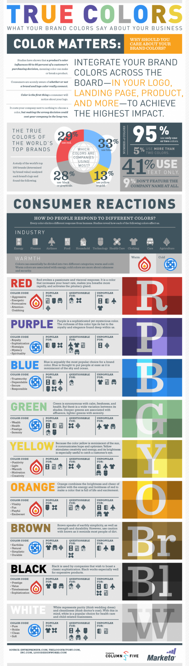
The following is another infographic by Column Five and Marketo, lifted from DailyInfographic.com, which asserts that ERA404’s terra cotta color combines the brightness and cheer of yellow with the energy and boldness of red to make a color that is full of life and excitement. It goes on to say that it signifies vitality, fun, playfulness, and exuberance and is popular among technology and healthcare companies, but unpopular with energy and companies, airlines, and clothing and automotive manufacturers.
Says DailyInfographic:
Branding is important. It is the factor that keeps your company standing out, gives your company a voice and gives you leverage over other similar companies. Having a strong brand is similar translates to having a strong presence in your industry and being a company that others turn to. Color is the most noticed aspect of a brand, and color is everything!
Color is best used when integrated throughout the company, making appearances in the logo, landing pages, websites, products and more to ensure maximum continuity. The most popular branding colors used by successful brands are red, blue, gray, and yellow.