 When Adam Goldstein approached ERA404 about designing labels for his new wine company, Brooklyn Wine Company, I have to admit I was pretty excited. If given a chance, I’d drink a beer over wine anyday, but I do really enjoy red wine. I, as with most uncultured palates, nearly always select a wine for its label rather than what I should’ve read in a Wine Connoisseur periodical. Even after having gone on a tour of Taittinger’s operation in Reims, France, a few years back, I just haven’t learned (or cared to learn) how to select a wine based on varietal, region or manufacturer. I think my stubbornness comes from the misconception that a cultured palate comes with an expensive taste…and I’m just not willing to part with money that easily.
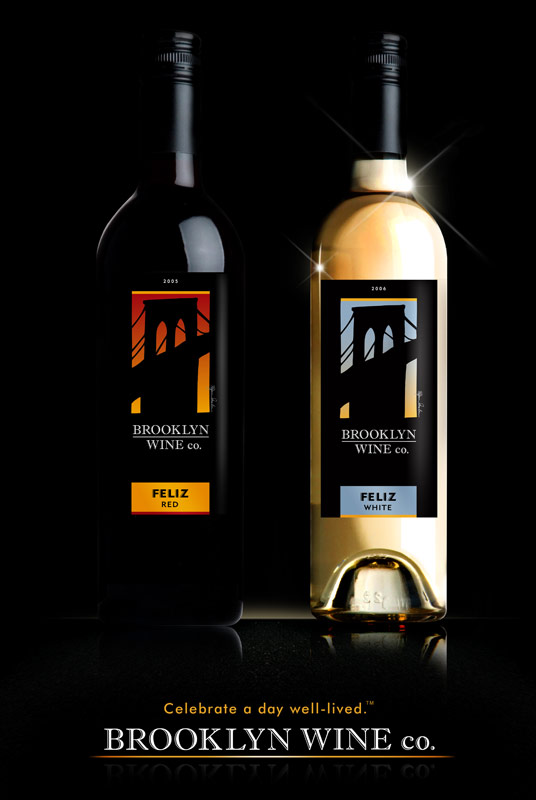
Adam, as with all great thinkers, has a pretty great view of how a wine label should be designed. When we started putting together his wine shop (Red White and Bubbly) site, we gave him the design for a wine shop. He absolutely loved and hated it. “What you’ve given me is a wine shop site,” he said. “And while it’s perfect, it’s not what I’m looking for.” “But it is a wine shop,” I replied. “Yes and no. I’m not selling wine, exclusively,” he said. “I’m promoting the idea, the spirit and vibe of Brooklyn.”