You may’ve noticed a new logo up there in the right corner of [d]online. To celebrate 10 years since I created my studio, era404 Creative Group, and because my stationery was finally running out, we felt it was time to update our brand.
 Over the last decade, era404 has truly transformed from a design and development shop to one that provides comprehensive, strategic campaigns. Our best projects—the most rewarding and enjoyable ones—have spawned from relationships with clients that have fully embraced our nature as an ideas company. This is to say that when clients approach us with ideas, they hire us for more than just implementation. Rather, we’ve been privileged to be involved from Day One concepting through the complete process of strategy, design, development and continued maintenance of their campaigns. With these projects, we’ve had the pleasure of not only participating in the growth of their ideas and bringing them to life, but helping shape them with our knowledge and experience in the industry.
While reflecting on these successes, and in an effort to promote ourselves better as a multi-disciplinary studio, we developed a creative brief of the obstacles that the previous logo presented. Part of this brief is as follows:
era//404 is a multi-disciplinary design, development and marketing studio based in New York City. The purpose of the era//404 rebranding effort is two-fold:
1. To better represent era//404 as a full service studio with a better focus on creative consulting and strategy, vs. the current branding which portrays era//404 as a development shop.
2. To modernize the brand, which is representative of a bygone era in web design and lacks flexibility to be adapted to more modern applications (twitter/IM icons, gravatars, Social Networking images, CAD title blocks, etc.).
Existing Design Issues
1. Requires three colors and doesn’t reduce well at smaller sizes on web sites
2. Not identifiable from a distance
3. Uses an overused font (Futura)
4. Incorporates URI slashes (//) which feel dated
5. Cannot be adapted to a broad palette, existing palette dated
6. “Creative Group” illegible and unnecessary
Recommendations
1. Create a new signature font that works well with curvilinear icons
2. Broaden palette and make logo encapsulated to be reproducible in new palette
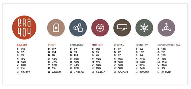
3. Develop strategy where palette colors are representative of disciplines (design, development, strategy, etc.)
4. Make logo bolder to work atop photography or CAD/3D renderings
5. Allow logo and icons to fit better within a square (for SN icons) and readable from a distance
6. Attempt to incorporate disciplinary icons into new branding to be recognizable as child brands of the era//404 main logo
7. Redefine usage standards (removing slashes when written, all caps/lowercase?)
8. Make brand feel more modern, less datable over the next decade
Not surprisingly, we quickly became our most finicky client. But with the input and feedback of our creative network, select clients whose opinions we find integral and other designers that we respect, we were able to come up with a design that we felt best satisfied the brief and the trials of our identity system from the last decade.

I’m pleased that we’ll be launching this new identity within the upcoming months and optimistic of the possibilities moving forward. I’d love to hear your feedback on the new brand—positive or negative—and look forward to learning how this repositioning will help us collaborate with clients on a more strategic and ubiquitous basis.
Special thanks to Gretchen Hehlo and Tina Roth-Eisenberg for their wisdom and patience on the hundreds of variations in palette and iconography.
Looks great, and I love the transparency — it’s great to see the thought process behind a very important update. Nice work.
Thanks Todd! Always nice to hear positive feedback.
Nice work on the design reel, did you learn all those techniques in that little brick building in Big Rapids?