Illustrations
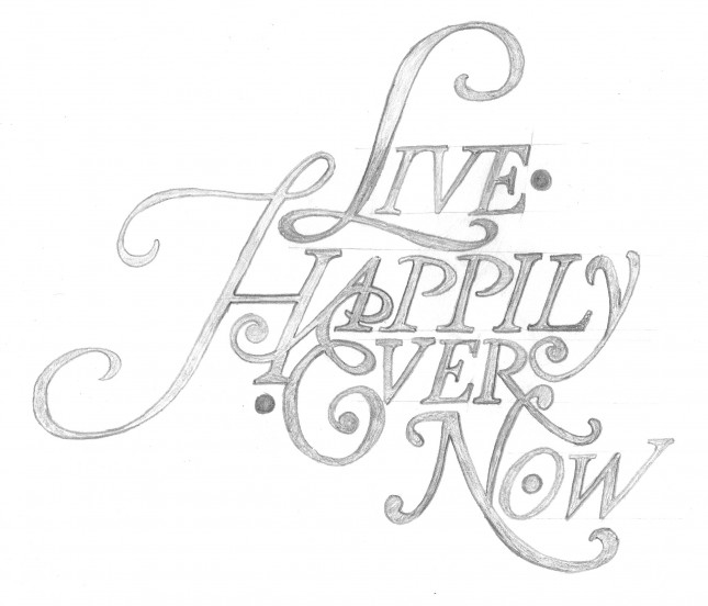
Live Happily Ever Now
My new design for a friend’s tattoo has been featured on The Daily Glyph. The design is an homage to Herb Lubalin and based roughly on the font Antique Ancienne (note his studio logo, at that link).
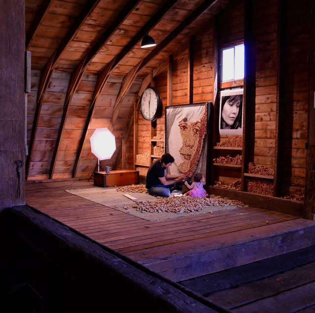
Dave Smith’s “Born and Raised” Album Artwork
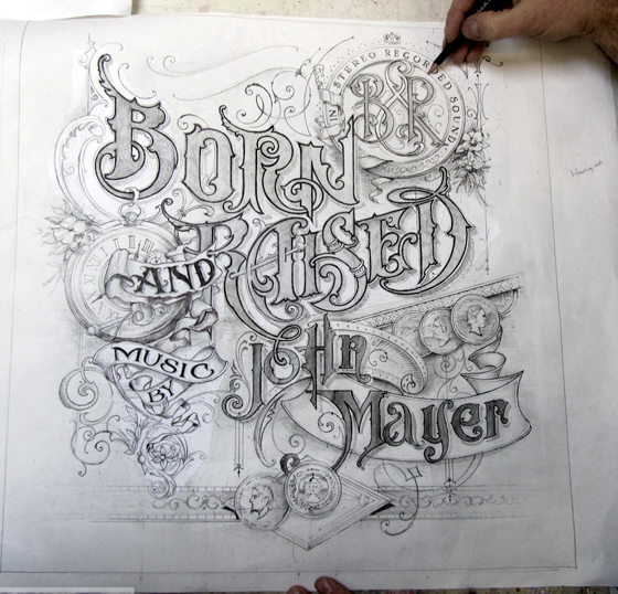
Smith: “Working with John on the brief of the artwork, he asked me to include coins, watches, flowers, and ribbons. I had a great start because of his direction and experience in graphic design and knew this would go smoothly. He also has a great eye for detail and design.”
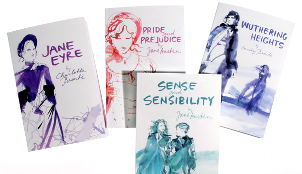
To Lure ‘Twilight’ Teenagers, Classic Books Get Bold Looks
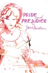
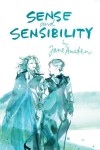
Teenagers are still reading the classics. They just don’t want them to look so, well, classic. That is the theory of publishers who are wrapping books like “Emma” and “Jane Eyre” in new covers: provocative, modern jackets in bold shades of scarlet and lime green that are explicitly aimed at teenagers raised on “Twilight” and “The Hunger Games.” The new versions are cutting edge replacements for the traditional (read: stuffy, boring) covers that have been a trademark of the classics for decades, those familiar, dour depictions of women wearing frilly clothing. In their place are images like the one of Romeo in stubble and a tight white tank top on a new Penguin edition of “Romeo and Juliet.”
