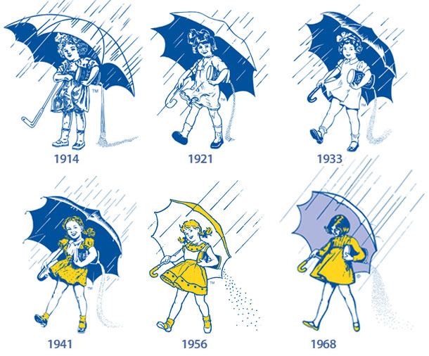
In light of Hurricane Sandy, I thought this post would be apropos. I really love seeing the evolution of brands over time, based on trends, fashion, sensibilities and the growth of a company/image/style. Here’s the “When it rains, it pours” Morton salt girl’s evolution:
illustration
Live Happily Ever Now
My new design for a friend’s tattoo has been featured on The Daily Glyph. The design is an homage to Herb Lubalin and based roughly on the font Antique Ancienne (note his studio logo, at that link).
Target Benchmarks Central Park Illustrations
In archiving old era404 projects, I just came across these twenty illustrations I created in 2003 for the Target Benchmarks Central Park event at Christie’s Auction House in the Rockefeller Center. The event was an auction to raise money for the Central Park Conservancy and produced/designed by Rand Burrus of Phoenix Event Productions. Each illustration was enlarged and reproduced on colossal 8′ x 8′ canvases to provide the backdrop for each of the benches being auctioned. In fact, after the bench auction was over, they began to auction off the illustrations too!
My last forays into illustrating for clients were for the Global Investment Literacy project and the Brooklyn Wine Company Sparkling White Wine Label. Target Benchmarks Central Park was a fun project and a chance to contribute artistically to a good cause. More information about the event can be found on the era404 website, here.
Envelope Drawings by Mark Powell
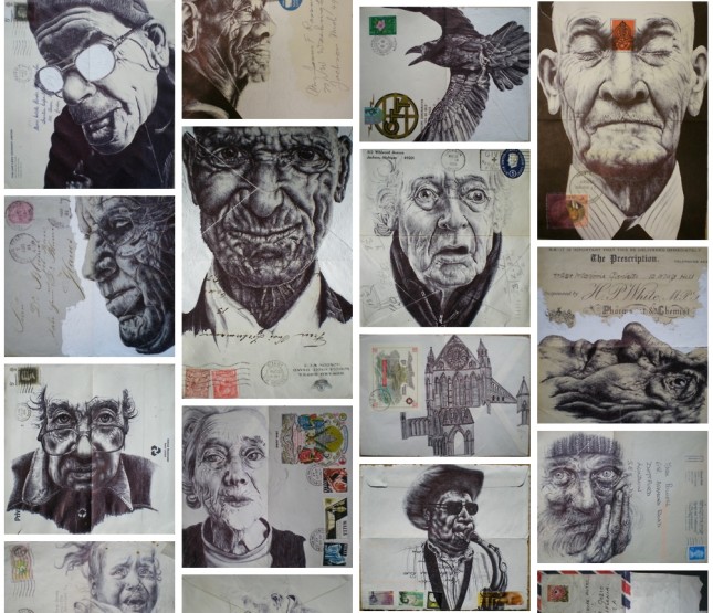
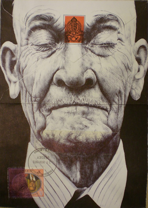
London-based artist Mark Powell’s Envelope Drawings are incredibly beautiful. More after the jump.
I Love Dust
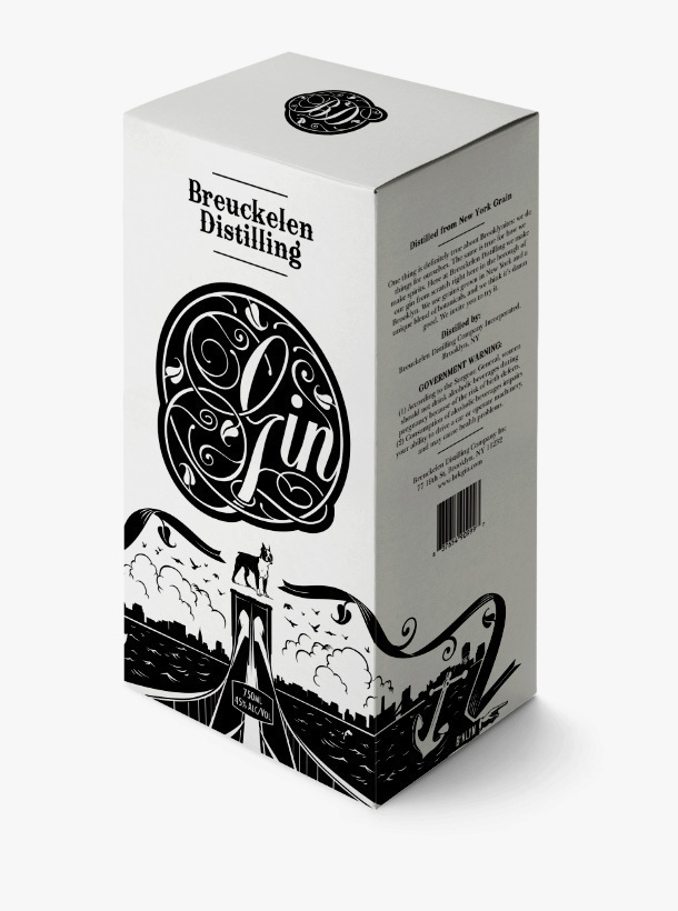
I really enjoy the product design work by I Love Dust. Take a look at the packaging for Breuckelen Distilling, a Brooklyn-based distillery, below.
