Seeing Herb Lubalin’s lovely Mother & Child logo in U & lc magazine began my obsession with ampersands. There has always been something elegant and foreign and vaguely mystical about the character. In band class, I imagined it the reverse treble clef. And in each hand-written letter from friends and relatives, I scoured their penmanship to see the nuance and personality they instilled in their own use of the ampersand. Was it the backwards 3? The pretzel? Was it rounded or squared off? Where was the baseline, the flair, the counters and eyes, the panache and bravado? What was the character of their character? Read more
type
The League of Moveable Type

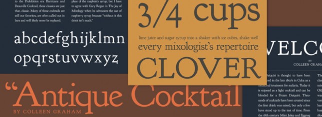
These online typographers are fed up with the “old fontstacks of yesteryear”. So they’ve compiled a wonderful little online resource of fonts to use for @font-face, cufon, and open-source type. Serifs, sans-serifs, specialty, grunge and ding-bats. The League of Moveable Type touts “no more bullshit” and invites typographers to come join their revolution. Consider me enlisted. Read more
