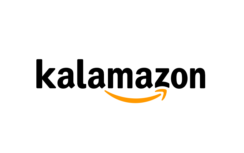
In case anyone was looking for a vector file of a mash-up between Kalamazoo and Amazon, I got you.
logo
Logos with Hidden Meanings

Black Cat
Killed

Piano Forest
Frankenstein Films

Twins
Newcastle Food & Wine Festival

Northwest Airlines
Yoga Australia

The Guild of Food Writers
Goodwill

Le Tour de France
Baskin Robbins

Hope for African Children Initiative
The Bronx Zoo

Spartan Golf club
Shift
Logofonts, by Emanuele Abrate


Emanuele Abrate illustrates the typefaces used in some of the most famous brands.
Your logo is copied, by Ferdinand Vogler

Airbnb vs Azuma Drive-In
Beats vs Stadt Brühl

Medium vs Metrocraft Publishing
OMV vs CTV

Fila vs Ferrero
Uber vs Carl Christiansen
20 Horrible Types of Feedback That Every Logo Designer Dreads
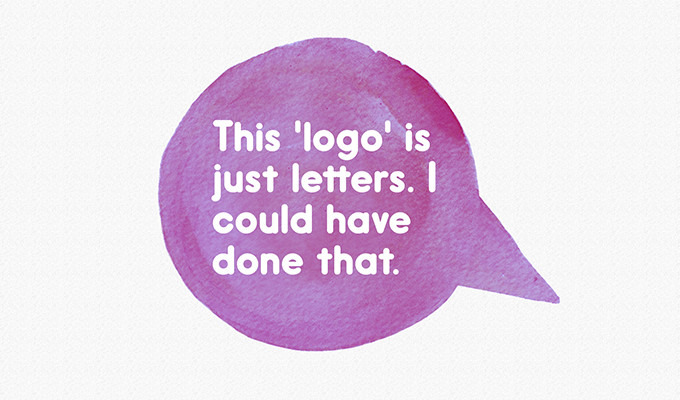
The following is a list, compiled by Derek Weathersbee of Creative Market.
Color Psychology in Logo Design
In this infographic by Muse Design, which has a curious mix of “color” and “colour” (homogenized below for your convenience), the designer provides some color commentary (so to speak) as to what colors consciously and subconsciously say: Read more
&

Seeing Herb Lubalin’s lovely Mother & Child logo in U & lc magazine began my obsession with ampersands. There has always been something elegant and foreign and vaguely mystical about the character. In band class, I imagined it the reverse treble clef. And in each hand-written letter from friends and relatives, I scoured their penmanship to see the nuance and personality they instilled in their own use of the ampersand. Was it the backwards 3? The pretzel? Was it rounded or squared off? Where was the baseline, the flair, the counters and eyes, the panache and bravado? What was the character of their character? Read more