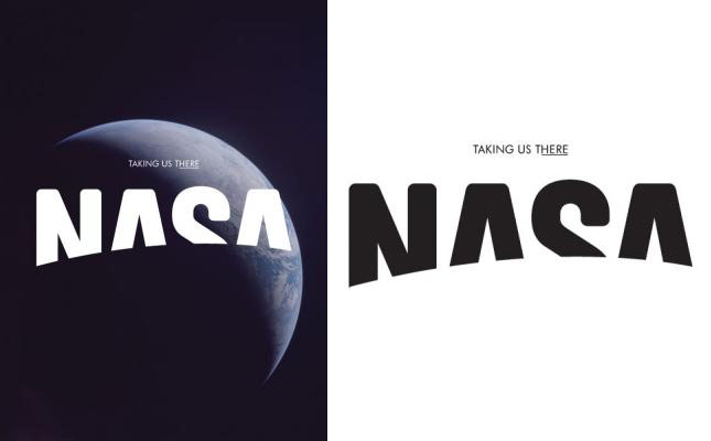
If you could redesign any brand, which would it be? This was the question asked of Base, a Brussels-based design firm, recently by Viewpoint magazine, The Future Laboratory’s bi-annual magazine about trends, brands, futures, and market strategies. Read their blog post, here.
simple concept, appropriate typeface, cleanly executed.. i like it! .. interesting choice with the underscore in the slogan– not too nuts about that. imho it complicates an otherwise elegantly minimal campaign.