The back acreage of a typeface conceals some of its greatest treasures, and tells some of typography’s most fascinating stories. Meet four typographic curios on which the designers at H&Co love to lavish special attention, and learn how these piquant spices can help turn up the flavor of your design.
ampersand
&
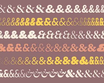
Seeing Herb Lubalin’s lovely Mother & Child logo in U & lc magazine began my obsession with ampersands. There has always been something elegant and foreign and vaguely mystical about the character. In band class, I imagined it the reverse treble clef. And in each hand-written letter from friends and relatives, I scoured their penmanship to see the nuance and personality they instilled in their own use of the ampersand. Was it the backwards 3? The pretzel? Was it rounded or squared off? Where was the baseline, the flair, the counters and eyes, the panache and bravado? What was the character of their character? Read more


