Emanuele Abrate illustrates the typefaces used in some of the most famous brands.
font
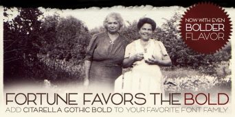
Citarella Gothic Bold on MyFonts
The third weight of the Citarella Gothic family is now available on MyFonts.
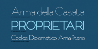
Citarella Gothic Regular
I’m happy to announce that Citarella Gothic Regular is available for download at MyFonts.com. Thanks to everyone for the kind words and encouragement since I released Citarella Gothic Ultralight back in January. Your support (and purchases) has really been a tremendous help in pushing this project forward. Thank you!
Citarella Gothic
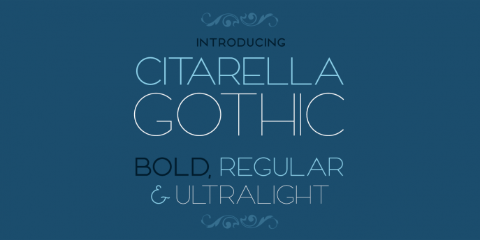
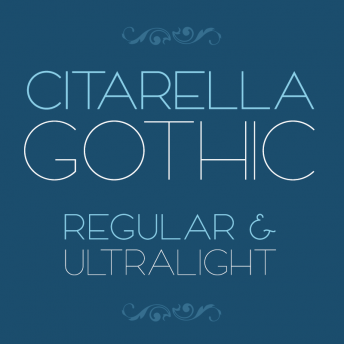
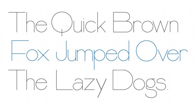
This is the beginning of a new type family that I’m working on, tentatively titled Citarella Gothic. I’m beginning with the Ultralight variant (seen above) and will be working through Black. I’d originally liked the idea of calling the font Citra, but a cursory Google search reveals there are already a number of brand names associated with Citra, so I may default to my last name. After all, I already have fonts named after this blog and my company, so why not create an eponymous one?*
The sizing and kerning are very rough, though your thoughts and feedback are certainly appreciated. Incidentally, here‘s a homework assignment from kindergarden my mom found in our basement. Apparently, I was designing fonts at Age 5.
* It’s not egoism if Francois Didot, Claude Garamond, Nicolas Jenson, Lucian Bernhard, Hermann Zapf, Giambattista Bodoni, Adrian Frutiger, John Baskerville, William Caslon, Eric Gill, Ed Benguiat, Frederic Goudy, and Herb Lubalin all did it.
This is Calibre
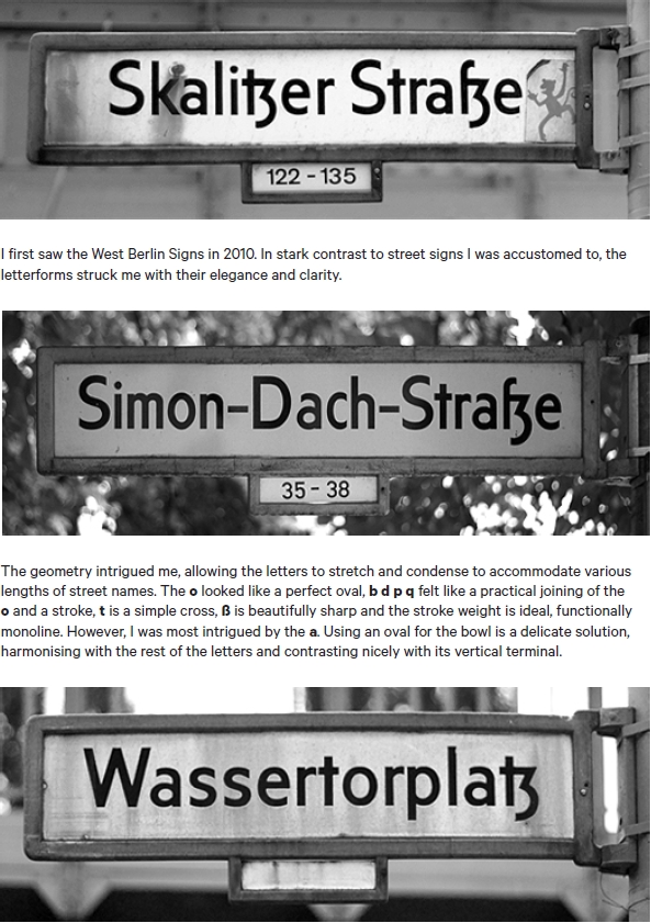
I really enjoyed reading the supporting documentation of Kris Sowersby’s Calibre typeface, “sired by West Berlin street signs” and “inspired by the rationality of Aldo Novarese’s seldom seen Recta“. Above is one such page from the documentation, which can be downloaded,here.
Live Happily Ever Now
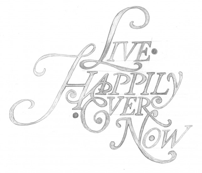
My new design for a friend’s tattoo has been featured on The Daily Glyph. The design is an homage to Herb Lubalin and based roughly on the font Antique Ancienne (note his studio logo, at that link).
Dave Smith’s “Born and Raised” Album Artwork
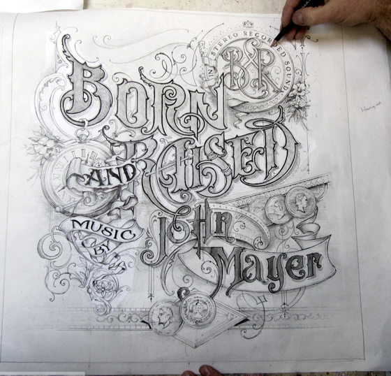
Smith: “Working with John on the brief of the artwork, he asked me to include coins, watches, flowers, and ribbons. I had a great start because of his direction and experience in graphic design and knew this would go smoothly. He also has a great eye for detail and design.”
