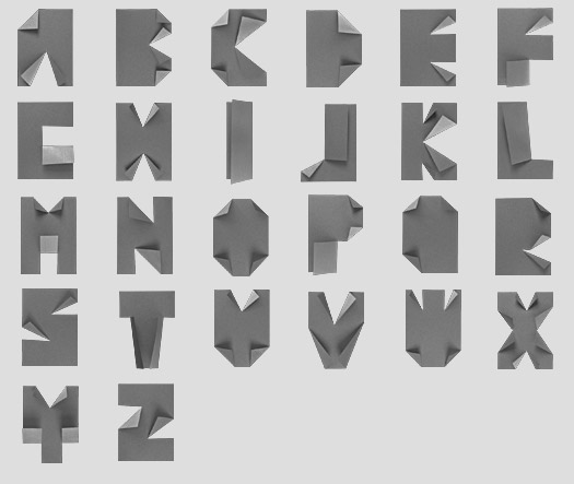
If you haven’t gotten a chance to see the site, I suggest you do. Some amazing, creative and crafty work that puts the rest of us digital font designers to shame.
font
[d]online Up[d]ates
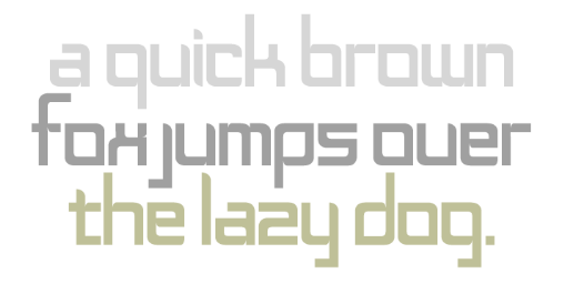
Two quick things in reference to my new [d]online typeface.
1. American Typographers: According to this site, put together by Luc Devroye, of the School of Computer Science at the esteemed McGill University in Montreal, I’m part of the American Type Scene and featured (less than prominently) on his New York City page:
 (by the way, the French example translates to “On the lap of the sorceress”)
Lettercase

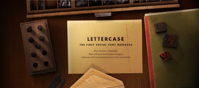
In light of the creation of [d]online, the font, and my recent post about The League of Moveable Type (to which [d]online was submitted), I did some poking around and found their new Social Font Manager, the Lettercase Application. Apparently, this application will enable like-minded typographers to collaboratively build typefaces. And, to this typophile and amateur typographer, with marginal ligature skills and a lack of patience for kerning, this is wonderful news.
The League of Moveable Type

These online typographers are fed up with the “old fontstacks of yesteryear”. So they’ve compiled a wonderful little online resource of fonts to use for @font-face, cufon, and open-source type. Serifs, sans-serifs, specialty, grunge and ding-bats. The League of Moveable Type touts “no more bullshit” and invites typographers to come join their revolution. Consider me enlisted. Read more
[d]online Typeface

That’s right! [d]online now has a new signature. Read more
Buttermilk, by Jessica Hische
I rarely get the opportunity to use script fonts. My dabbling in the geometric hand has, for the last ten years, been limited to IDs (see Frances Schultz) and Holiday Cards. For the most part, when hand-written fonts are used, I opt instead for the handwriting of calligraphers and illustrators within our network. Actually, the only deviation that I can think of was when we designed the Target Holiday Boat, in NYC’s Chelsea Piers, and that was a gross overuse of House Industries’ League Night (from the House-a-rama collection). And while I still absolutely love that face, which resembles more of a hoe-down than a bowling jersey, Ms. Hische’s work has always inspired me to get in touch with the feminine fontographer inside of me. Buttermilk, as well, churns this feeling. As a result of my vulnerability in this catharsis, I believe you should buy Buttermilk and as a gift for all your clients prior to the upcoming holiday season, so that they may, in turn, return to you to design their holiday cards and identities.


