God I really, REALLY wish they seized this opportunity to get rid of Continental’s dated globe icon. It looks like all they did was change the font to a Gothic face and call it a day. What a waste of a great chance to reinvent themselves.
iconography
Random Musings III
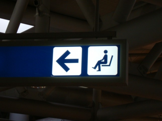
Sir, this area is just for waiting
After just having returned from a month researching my family in Italy (we were able to trace our family back to 1200 when previously we couldn’t get past 1860), I noticed the prevalence of the green man over The States’ preference for the red word “Exit”. But I also saw a number of signs that I felt were funny. Here’s one for the “waiting area” of an airport. In a place where iconography is especially important due to so many international speakers around, I initially thought this was a sign for the bathroom.

