As my studio works with creatives for design and development, we often send archived resources through email. Up until recently, I always just thought that my developers were more organized and less rash than my designers. However, last week I learned that I’d mistaken a bug in Microsoft Outlook as creative absent-mindedness. Read more
Author: Don
What Color is this Dress?
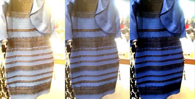
While I’m fascinated with the science behind why the internet can’t seem to agree on the color of the dress—posted by swiked to her tumbler on February 25th—I’m more interested in how it affects my job as a graphic designer. Read more
Salon de Guerre
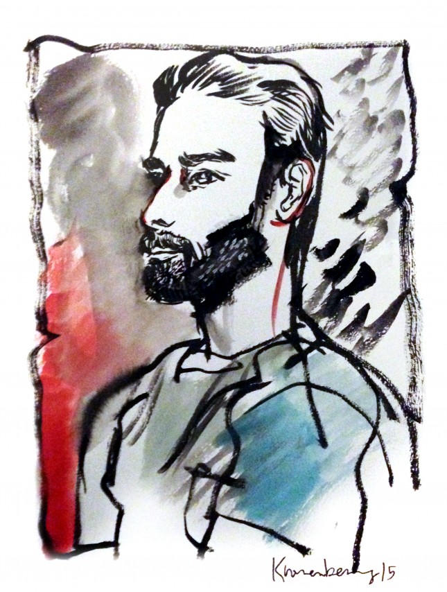
I recently went to a Portrait Painting Marathon and Salon de Guerre, hosted by Dr. Barnaby Ruhe, at the Westbeth Artists Housing (original headquarters of Bell Telephone Laboratories) in the West Village. Essentially, it’s a studio where a bunch of artists set-up easels and pour wine and socialize about the art world while musicians play and aficionados pose, drink, and discuss trends and installations. It was very Basquiat, but on the other side of the island and nobody overdosed on heroin. My favorite quote of the evening came from a woman named Maggie, who said: “I moved to Manhattan, expecting it to be like this every night. It took 20 years, but now I’ve found it.”
Other artists include Eileen Coyne, and Emmanuelle Linard. Above is a painting of me by Michael Kronenberg.
Da Capo Photo Credit
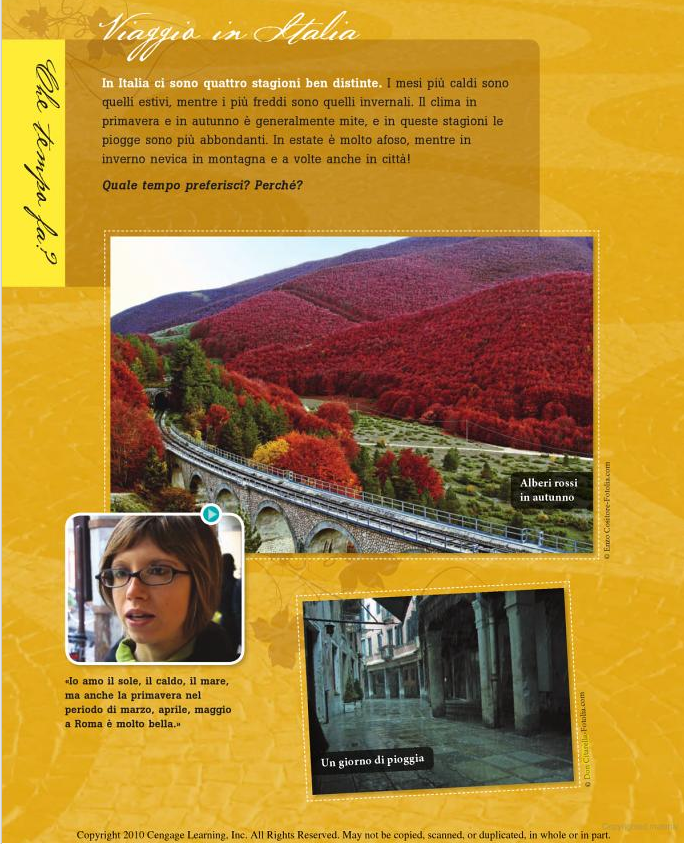
One of my photos from Venice, now featured on Fotolia.com, was used in the book, Da Capo, by Antonio Morena, Donatella Melucci, Annamaria Moneti, and Graziana Lazzarino, with the caption “Un giorno di pioggia” (A day of rain).
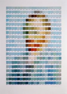
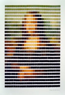
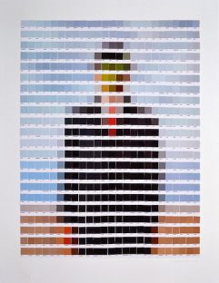
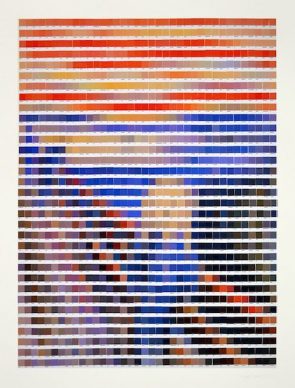
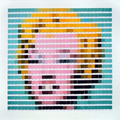
Artistic masterpieces rendered in Pantone swatches
Just the other day, Pantone named Marsala the color of 2015, and the decision, er, “has critics seeing red.” The only thing that gets art and design people more worked up than Pantone swatches is the rampant overuse of Comic Sans. Art and design people LOVE Pantone. … thus it was inevitable that someone would do what London artist Nick Smith did, and create quasi-“pixelated” versions of famous art masterpieces, only using Pantone swatches.
Smith currently has an exhibition called “Psycolourgy” at the Lawrence Alkin Gallery near Covent Garden. The show runs through February 20.
(via Dan and dangerousminds.net)
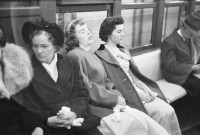
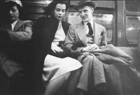
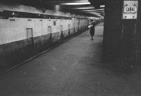
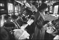
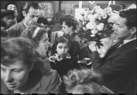
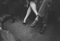
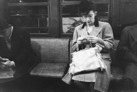
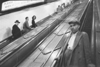
Stanley Kubrick’s Underground NYC
In 1946, Stanley Kubrick, then aged only 18, took these photographs of the New York Subway and had them published by LOOK magazine. He photographed for the magazine from 1945 to 1950.
According to Helen O’Brian, head of LOOK’s photographic department, Kubrick generated the highest number of published articles of any photographer she had worked with. At the time, Kubrick was the youngest photographer LOOK had had on its books.
