Displaying a carefree confidence and a daring curiosity that animates our creative spirit, inquisitive and intriguing PANTONE 17-3938 Very Peri helps us to embrace this altered landscape of possibilities, opening us up to a new vision as we rewrite our lives. Rekindling gratitude for some of the qualities that blue represents complemented by a new perspective that resonates today, PANTONE 17-3938 Very Peri places the future ahead in a new light.
Practical and rock solid but at the same time warming and optimistic, the union of PANTONE 17-5104 Ultimate Gray + PANTONE 13-0647 Illuminating is one of strength and positivity. It is a story of color that encapsulates deeper feelings of thoughtfulness with the promise of something sunny and friendly. Read more
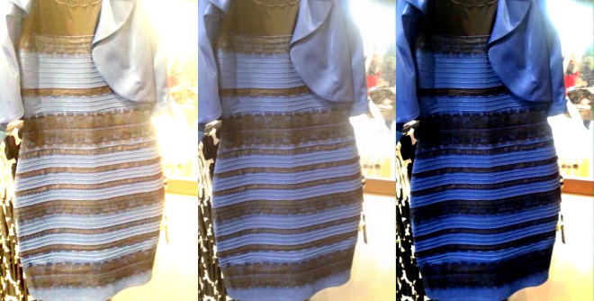
While I’m fascinated with the science behind why the internet can’t seem to agree on the color of the dress—posted by swiked to her tumbler on February 25th—I’m more interested in how it affects my job as a graphic designer. Read more
Just the other day, Pantone named Marsala the color of 2015, and the decision, er, “has critics seeing red.” The only thing that gets art and design people more worked up than Pantone swatches is the rampant overuse of Comic Sans. Art and design people LOVE Pantone. … thus it was inevitable that someone would do what London artist Nick Smith did, and create quasi-“pixelated” versions of famous art masterpieces, only using Pantone swatches.
Smith currently has an exhibition called “Psycolourgy” at the Lawrence Alkin Gallery near Covent Garden. The show runs through February 20.
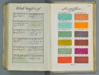
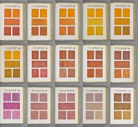
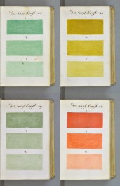
271 Years Before Pantone, an Artist Mixed and Described Every Color Imaginable in an 800-Page Book
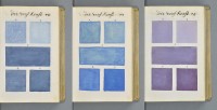
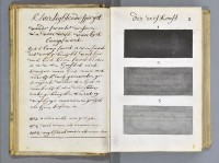
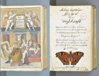
In 1692 an artist known only as “A. Boogert” sat down to write a book in Dutch about mixing watercolors. Not only would he begin the book with a bit about the use of color in painting, but would go on to explain how to create certain hues and change the tone by adding one, two, or three parts of water. The premise sounds simple enough, but the final product is almost unfathomable in its detail and scope.
Spanning nearly 800 completely handwritten (and painted) pages, Traité des couleurs servant à la peinture à l’eau (Treaty of colors used to paint water), was probably the most comprehensive guide to paint and color of its time. According to Medieval book historianErik Kwakkel who translated part of the introduction, the color book was intended as an educational guide. The irony being there was only a single copy that was probably seen by very few eyes.
It’s hard not to compare the hundreds of pages of color to its contemporary equivalent, the Pantone Color Guide, which wouldn’t be published for the first time until 1963.
The book is currently kept at the Bibliothèque Méjanes in Aix-en-Provence, France.
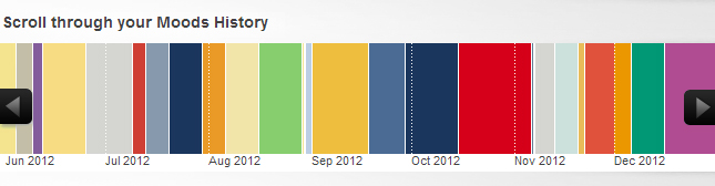
If you haven’t already checked it out, the Pantone Moods Facebook application that was conceived and created by ERA404, has a history and trends tab. The trends tab shows current mood matches, based on color, mood blurb, gender, date/time of submission, and distance from you. It also compares your current mood color and blurb based on gender, location, color match, word match, and frequency. Lastly, it shows global mood trends with the most active gender (female) and color (21-1-7 C), most active location (São Paulo) and color (21-1-7 C), most popular color now (1-1-6 C) and of all time (21-1-7 C), and most popular words (color, blue, feeling, today, happy) and colors (21-1-7 C, 76-1-7 C, 1-1-6 C, 132-1-4 C). Read more