


Displaying a carefree confidence and a daring curiosity that animates our creative spirit, inquisitive and intriguing PANTONE 17-3938 Very Peri helps us to embrace this altered landscape of possibilities, opening us up to a new vision as we rewrite our lives. Rekindling gratitude for some of the qualities that blue represents complemented by a new perspective that resonates today, PANTONE 17-3938 Very Peri places the future ahead in a new light.
(via Pantone.com)


Practical and rock solid but at the same time warming and optimistic, the union of PANTONE 17-5104 Ultimate Gray + PANTONE 13-0647 Illuminating is one of strength and positivity. It is a story of color that encapsulates deeper feelings of thoughtfulness with the promise of something sunny and friendly. Read more
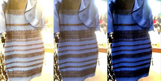
While I’m fascinated with the science behind why the internet can’t seem to agree on the color of the dress—posted by swiked to her tumbler on February 25th—I’m more interested in how it affects my job as a graphic designer. Read more
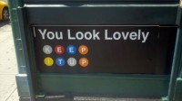
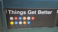
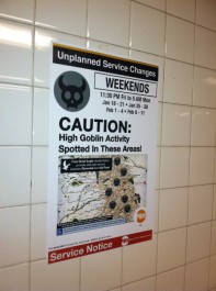
Subway Art Blog has a wonderful collection of fake, manipulated, and humorous subway signs and posters, curated by Jowy Romano. Some of these are really clever.
Warning: Bad Puns Ahead

Read this sign—posted on Washington and 1st, here in Hoboken—and tell me if you see any issues with it. Imagine being a foreigner to the United States who has never seen this sign before. Imagine being someone that doesn’t speak English as a primary language, like so many tourists and visitors to New York. Read more

Special thanks to @ForwardMyMail for pointing out this wonderful article about iconography, image recognition, strategy in environmental design and international cultural differences. Many designers, myself included, deal with these arguments every day — though not specifically with exit signs. And these ideas are a source of not only a lot of headaches and heated discussions, but also rewarding and enjoyable.