In this infographic by Muse Design, which has a curious mix of “color” and “colour” (homogenized below for your convenience), the designer provides some color commentary (so to speak) as to what colors consciously and subconsciously say: Read more
Identity
ERA404 Rebranding

You may’ve noticed a new logo up there in the right corner of [d]online. To celebrate 10 years since I created my studio, era404 Creative Group, and because my stationery was finally running out, we felt it was time to update our brand.
 Over the last decade, era404 has truly transformed from a design and development shop to one that provides comprehensive, strategic campaigns. Our best projects—the most rewarding and enjoyable ones—have spawned from relationships with clients that have fully embraced our nature as an ideas company. This is to say that when clients approach us with ideas, they hire us for more than just implementation. Rather, we’ve been privileged to be involved from Day One concepting through the complete process of strategy, design, development and continued maintenance of their campaigns. With these projects, we’ve had the pleasure of not only participating in the growth of their ideas and bringing them to life, but helping shape them with our knowledge and experience in the industry. Read more
United Airlines’ New Logo
God I really, REALLY wish they seized this opportunity to get rid of Continental’s dated globe icon. It looks like all they did was change the font to a Gothic face and call it a day. What a waste of a great chance to reinvent themselves.
Base’s New NASA Logo

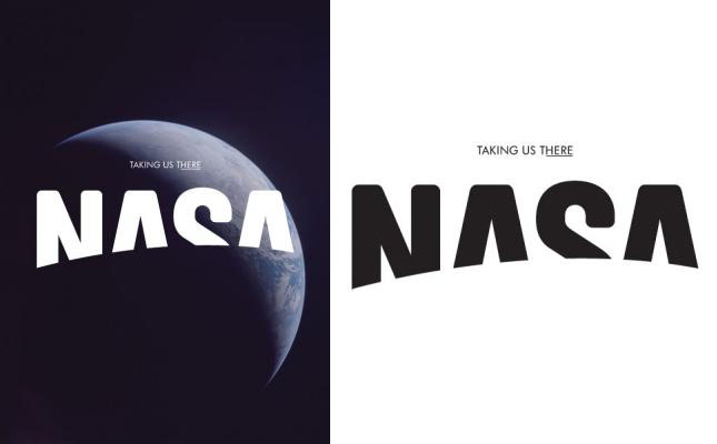
If you could redesign any brand, which would it be? This was the question asked of Base, a Brussels-based design firm, recently by Viewpoint magazine, The Future Laboratory’s bi-annual magazine about trends, brands, futures, and market strategies. Read their blog post, here.


 Ironically, the same week I received my AIGA email about the presentation by Scott Stowell (designer of the BRAVO logo), I also started my first