Citarella Gothic Ultralight

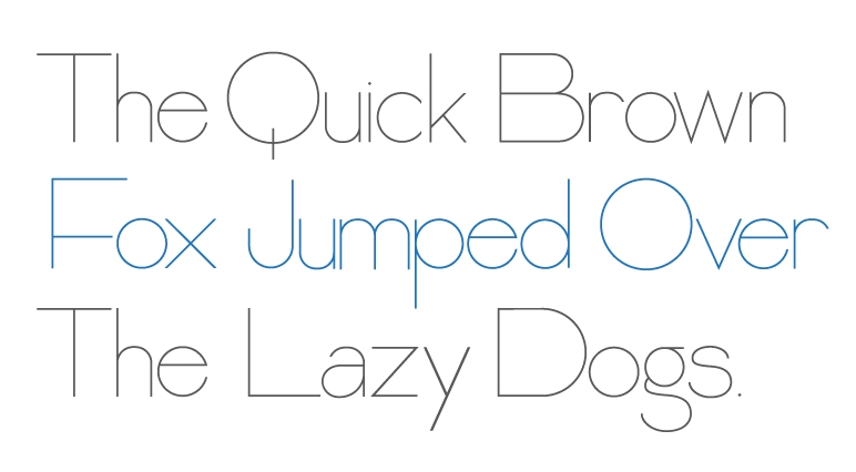
I’m happy to announce that Citarella Gothic Ultralight is officially on-sale at MyFonts. Here’s the description:

About Citarella Gothic:
In seeking a strong, utilitarian gothic alternative for Helvetica, we’re left with few options for unobtrusive functionalism. As such, I decided to create the Citarella Gothic family. The ligatures are characteristic of the signage and architecture around Sarno, Italy, where the Citarella family originates. The sweeping arcs, broad counters, and clean swashes allow for the architectural design to be imbued with the warmth and humanity of its namesake.

Over time, I hope to extend the family to other weights and styles, but decided to start with the ultralight version and work my way through black. In the meantime, visit MyFonts.com to play around with the font. Your feedback is appreciated, as is, of course, your patronage.

MyFonts: Citarella Gothic Ultralight

Citarella Gothic

Citarella Gothic Ultralight

This is the beginning of a new type family that I’m working on, tentatively titled Citarella Gothic. I’m beginning with the Ultralight variant (seen above) and will be working through Black. I’d originally liked the idea of calling the font Citra, but a cursory Google search reveals there are already a number of brand names associated with Citra, so I may default to my last name. After all, I already have fonts named after this blog and my company, so why not create an eponymous one?*

The sizing and kerning are very rough, though your thoughts and feedback are certainly appreciated. Incidentally, here‘s a homework assignment from kindergarden my mom found in our basement. Apparently, I was designing fonts at Age 5.

* It’s not egoism if Francois Didot, Claude Garamond, Nicolas Jenson, Lucian Bernhard, Hermann Zapf, Giambattista Bodoni, Adrian Frutiger, John Baskerville, William Caslon, Eric Gill, Ed Benguiat, Frederic Goudy, and Herb Lubalin all did it.

Urban Illumination

Shoe Toss lamps

If you’re on the hunt for a truly unique lamp to accessorize your living room, Etsy is a far better place to start than Ikea. Because that’s the only place you’ll be able to buy this illuminating creation from Ricochet Studio that looks like a pair of shoes tossed over a power line. Read more

Les Couleurs

271 Years Before Pantone, an Artist Mixed and Described Every Color Imaginable in an 800-Page Book

In 1692 an artist known only as “A. Boogert” sat down to write a book in Dutch about mixing watercolors. Not only would he begin the book with a bit about the use of color in painting, but would go on to explain how to create certain hues and change the tone by adding one, two, or three parts of water. The premise sounds simple enough, but the final product is almost unfathomable in its detail and scope.

Spanning nearly 800 completely handwritten (and painted) pages, Traité des couleurs servant à la peinture à l’eau (Treaty of colors used to paint water), was probably the most comprehensive guide to paint and color of its time. According to Medieval book historianErik Kwakkel who translated part of the introduction, the color book was intended as an educational guide. The irony being there was only a single copy that was probably seen by very few eyes.

It’s hard not to compare the hundreds of pages of color to its contemporary equivalent, the Pantone Color Guide, which wouldn’t be published for the first time until 1963.

The book is currently kept at the Bibliothèque Méjanes in Aix-en-Provence, France.

(via This is Colossal)