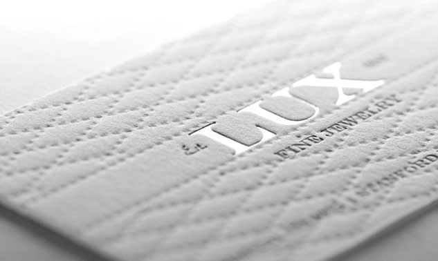
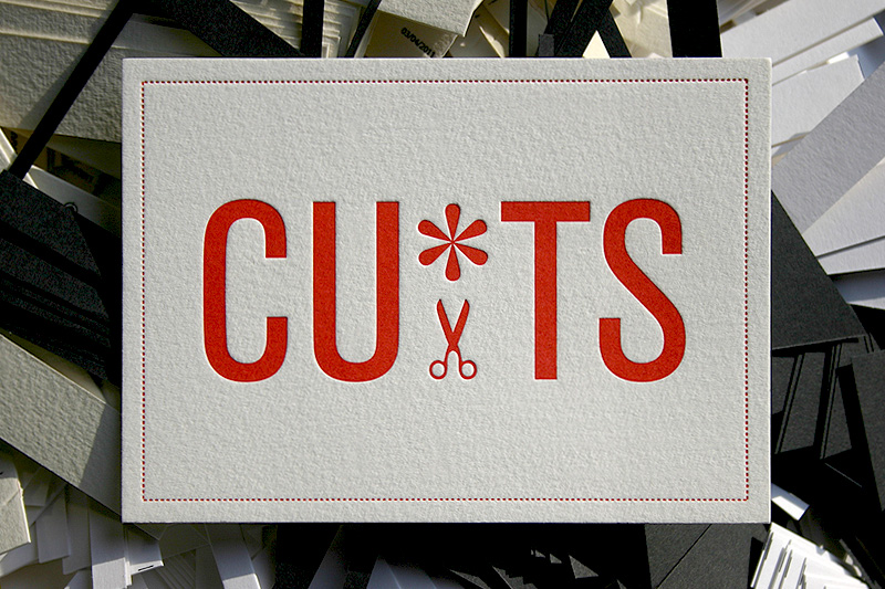
Some beautiful examples of embossed, debossed, engraved and textural business cards and stationery.


Outliers is an ongoing project by artist Maskull Lasserre where shoes are outfitted with specially carved rubber soles meant to mimic the footprints of moose, Kodiak bears, deer, rabbits and other animals. The shoes are then worn in the snow leaving the impression to unsuspecting passersby that wildlife has wandered into urban areas including Montreal, Ottawa, Boston, and New York. See much more on his website. (via thisiscolossal.com)
era404‘s PANTONE® Moods Facebook Application widget is now live on Pantone.com. The widget streams realtime Moods updates from around the world and provides the previous day’s most popular colors, moods, cities and words. Try submitting a mood from your Facebook app to see it on every page of the Pantone site.
Read the press release, here: http://www.era404.com/press/pantone-moods-widget-on-pantone-com/
I always say that the cobbler’s kids have the oldest shoes. The last relaunch of era404.com had been in 2005, before the widespread use of iOS devices (which don’t support Adobe Flash) and the release of browsers capable of supporting HTML5, CSS3 and JQuery.
For the last few years, as all designers seem to do, I kept saying “God, I really need to update our site.” As my brother Chris always says, “the second worst problem in the world is having too much work, but it’s far better than the alternative.” era404 has been fortunate in that we’ve never found ourselves with too much idle time on our hands. That said, we’ve been seriously lacking in the capacity to explore new business development and professional upkeep and maintenance on our public image. Until now. Read more
Simple, creative and brilliant.
Source: http://www.flickr.com/photos/hertzen/4835891330/in/set-72157624026063799/

I made these simple 8px x 8px icons for the new era404 portfolio site, due to launch this month. They’re fairly simple, clean and monochromatic so as not to detract from the corresponding links or messages. If you like them, grab an archive of them, here.