Pantone 2022 Color of the Year: Very Peri

Displaying a carefree confidence and a daring curiosity that animates our creative spirit, inquisitive and intriguing PANTONE 17-3938 Very Peri helps us to embrace this altered landscape of possibilities, opening us up to a new vision as we rewrite our lives. Rekindling gratitude for some of the qualities that blue represents complemented by a new perspective that resonates today, PANTONE 17-3938 Very Peri places the future ahead in a new light.

(via Pantone.com)

The Herb Ritts Foundation

The Herb Ritts Foundation

This week, my design and development studio, ERA404, launched the new web site for The Herb Ritts Foundation. The press release is below.

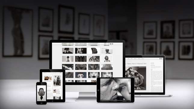
Los Angeles—HERBRITTS.com features the largest collection of the late photographer’s work online, while offering the opportunity to explore every aspect of his career.

Dozens of editorial examples, advertising tear sheets, book spreads, and museum installation photos mixed together demonstrate how Ritts’ work embedded itself into popular culture.

In addition to producing portraits and editorial fashion for Vogue, Vanity Fair, Interview and Rolling Stone, Ritts also created successful advertising campaigns for Calvin Klein, Chanel, Donna Karan, Gap, Gianfranco Ferré, Gianni Versace, Giorgio Armani, Levi’s, Pirelli, Polo Ralph Lauren, and Valentino among others.

The site features an interactive timeline of Herb Ritts’ life. For the first time, visitors are able to see examples of Ritts’ directing work including award-winning music videos and commercials. Further insight is offered into the Foundation’s history and mission: to advance the art of photography and support HIV/AIDS causes in a manner that reflects the spirit and values exemplified by Herb Ritts during his lifetime.

Designed and developed by ERA404 Creative Group, the site allows visitors to conduct advanced searches through Ritts’ vast archives and follow the Foundations social media presence.

Herb Ritts’ iconic images have been exhibited in museums worldwide, including hugely popular exhibitions at The Museum of Fine Arts, Boston and The J. Paul Getty Museum in Los Angeles.

(via ERA404.com)

Project Comet

Project Comet

Adobe’s Project Comet, coming in 2016, promises to let us design and prototype websites and mobile apps with the same tool.

More than just allowing for interactive prototypes—which we’ve done with Invision—it also provides functionality to let us update the design (seamlessly with Photoshop and Illustrator) without losing any changes to the prototype, and touts lightning-fast performance with intuitive layout tools.

Read more

56 Months of Pantone Moods

If you haven’t already checked it out, the Pantone Moods Facebook application that was conceived and created by ERA404, has a history and trends tab. The trends tab shows current mood matches, based on color, mood blurb, gender, date/time of submission, and distance from you. It also compares your current mood color and blurb based on gender, location, color match, word match, and frequency. Lastly, it shows global mood trends with the most active gender (female) and color (21-1-7 C), most active location (São Paulo) and color (21-1-7 C), most popular color now (1-1-6 C) and of all time (21-1-7 C), and most popular words (color, blue, feeling, today, happy) and colors (21-1-7 C, 76-1-7 C, 1-1-6 C, 132-1-4 C).
Read more

iPhone Blueprints: Fundamentals of User Interface Design

iPhone Blueprints is a new book by Scott Jensen that covers User Interface Design and its importance. In the book, Scott deals with everything needed to create an effective user interface. Most of the books that are available on the subject are typically full of design patterns with tons of theory and very little actual usable information. iPhone Blueprints [iBookstore link] is being featured here because it looks spectacular on the iPad and is one of the best guide books on UI design for the iPhone in existence today. The author currently works at Ender Labs that brought us the lovely music player app Track 8.

Everything from the book cover to the chapter mastheads in this book is drool-worthy. The book is split up into 9 main sections. The introduction deals with why UI is important and the author then goes on to discuss who makes a good designer by drawing some brilliant examples. I love the emphasis on why UI and UX go together.

“If you’re a UI designer, you should be making UX decisions. Otherwise, you’re a decorator, nothing more.”

Original article on BeautifulPixels.com