Typeface T-Shirts

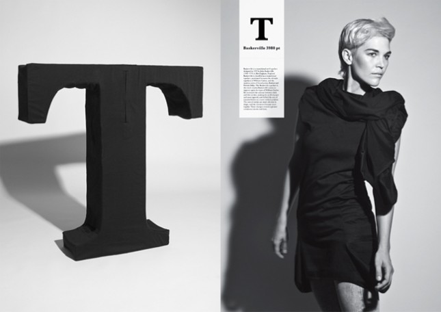
These shirts that were designed to have the silhouette of 5 famous typefaces; Helvetica, Caslon, Baskerville, Courier, and Cooper Black.

In the world of typography, terms such as typeface, character, body, etc are used to describe the form of a letter. The reason why they use expressions closely related to a human body, is perhaps because each different letter has a distinct quality and personality, in a similar way that us humans are all unique.

Read more

Public Enemies Font

Turns out Michael Mann, the Director of ‘Public Enemies’, is a control freak perfectionist in every area of crafting a movie….. that’s a compliment by the way.

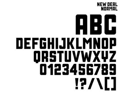
To get the type face of the title just right, Mann commissioned a special font from Neville Brody who says:
“Michael Mann understands the power of a good title sequence and always commissions his own. For Public Enemies, he wanted a font that evoked the Depression era, so I got inspiration from publicity posters for Roosevelt’s New Deal initiative. “

[d]online Up[d]ates

Two quick things in reference to my new [d]online typeface.

1. American Typographers: According to this site, put together by Luc Devroye, of the School of Computer Science at the esteemed McGill University in Montreal, I’m part of the American Type Scene and featured (less than prominently) on his New York City page:
devroye(by the way, the French example translates to “On the lap of the sorceress”)
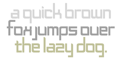
2. MyFonts: I’m now listed on myfonts.com: