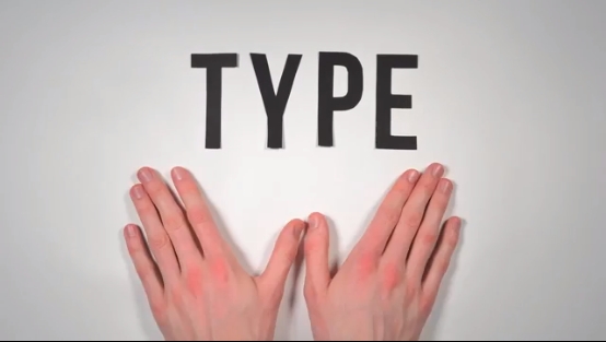
httpv://www.youtube.com/watch?v=wOgIkxAfJsk
A paper-letter animation about the history of fonts and typography. 291 Paper Letters. 2,454 Photographs. 140 hours of work.
httpv://www.youtube.com/watch?v=wOgIkxAfJsk
A paper-letter animation about the history of fonts and typography. 291 Paper Letters. 2,454 Photographs. 140 hours of work.
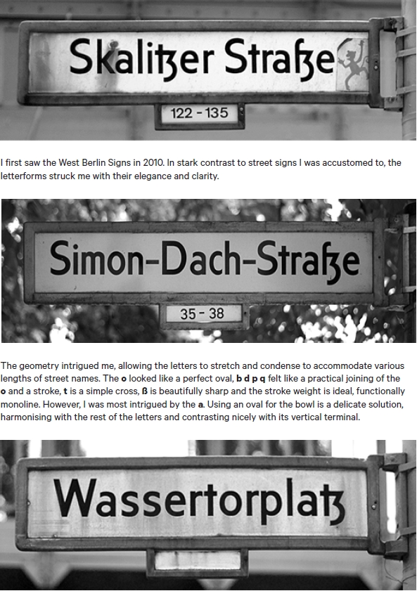
I really enjoyed reading the supporting documentation of Kris Sowersby’s Calibre typeface, “sired by West Berlin street signs” and “inspired by the rationality of Aldo Novarese’s seldom seen Recta“. Above is one such page from the documentation, which can be downloaded,here.
Simple, creative and brilliant.

Source: http://www.flickr.com/photos/hertzen/4835891330/in/set-72157624026063799/

Seeing Herb Lubalin’s lovely Mother & Child logo in U & lc magazine began my obsession with ampersands. There has always been something elegant and foreign and vaguely mystical about the character. In band class, I imagined it the reverse treble clef. And in each hand-written letter from friends and relatives, I scoured their penmanship to see the nuance and personality they instilled in their own use of the ampersand. Was it the backwards 3? The pretzel? Was it rounded or squared off? Where was the baseline, the flair, the counters and eyes, the panache and bravado? What was the character of their character? Read more
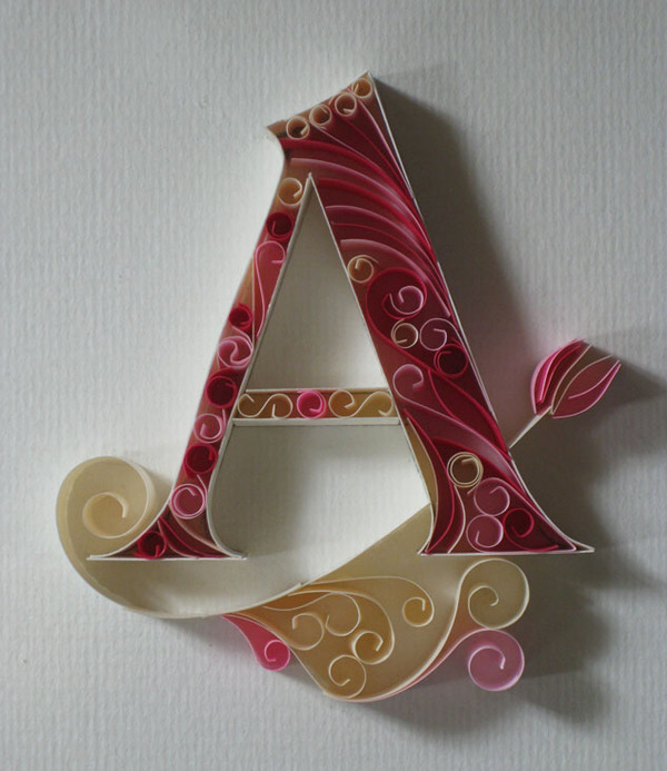
Take a look at this beautifully meticulous, hand-crafted paper alphabet by Sabeena Karnik, a caligrapher, fine artist and illustrator/ typographer specializing in paper sculpturing and acrylic murals.

This week, I was delighted to learn from a few separate sources that [d]online was featured on the MyFonts.com home page. I have to assume that this coveted real estate is reserved for fonts that portray their catalog in a positive light and feel honored that they selected one of my typefaces to do so. I’m hoping that my second font, era404 Regular, will pop-up there at some point too.

Since August 2010, [d]online Medium has been downloaded 13,643 times on dafont.com. Since January 2011, era404 Regular has been downloaded 7,619 times. And as I watched these numbers continue to rise, a collective 21,000 downloads of my typefaces, I began to wonder if people were only downloading them because they were free or if people liked them enough to spend some money on them.