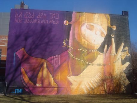
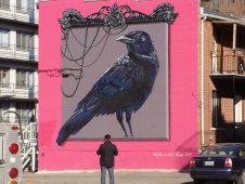
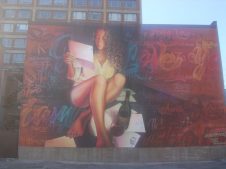
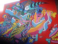
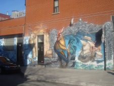
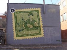
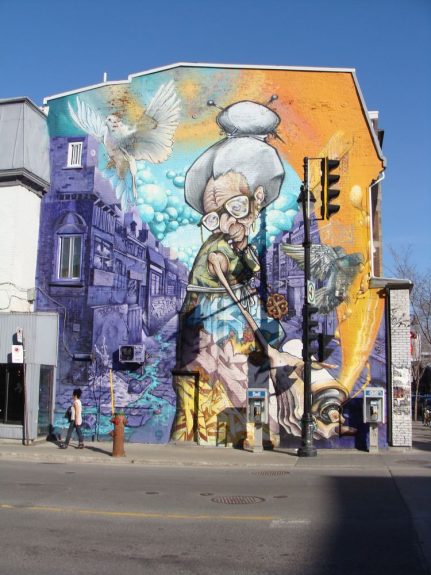
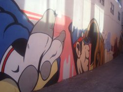
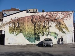
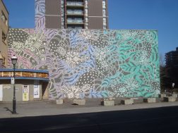
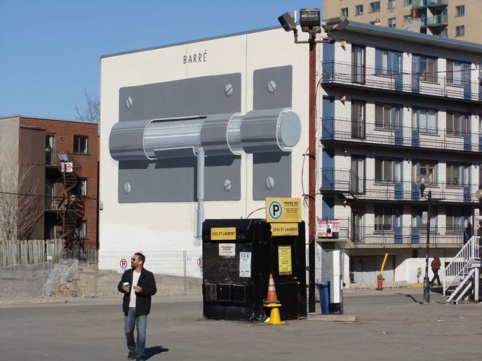
One of the most beautiful and surprising things about my birthday trip to Montreal was how many murals are around the city. The creativity and craftsmanship that went into each was astonishing. I highly recommend a walk down Saint-Laurent Street to see these works of art in person.
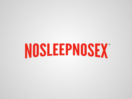
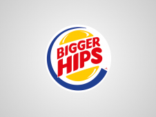
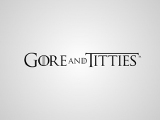
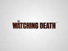
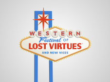
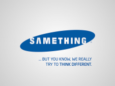
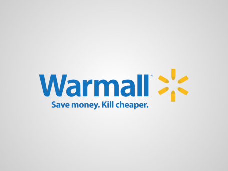
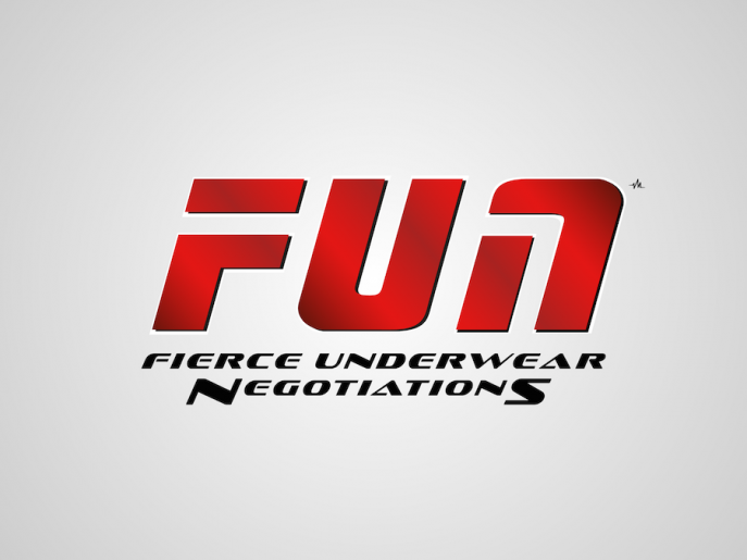
Honest Logos, by Viktor Hertz
Quinceañera404
Originally published in the ERA404 Newsletter on April 4, 2016:
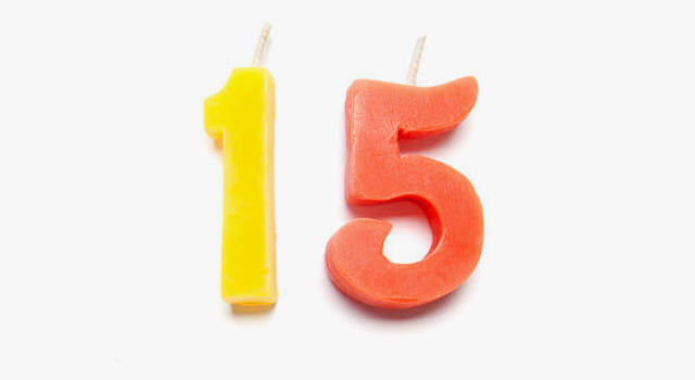
Happy 4/04! It’s a momentous one, too. Fifteen years ago, I began moonlighting as a freelance graphic designer in New York City, while working a day-job at a now-defunct dot-com. My first gig was designing the CD packaging for a DJ that was a friend of a friend. My payment was a 12-pack of Heineken. I had purchased the domain for ERA404 back in college, after a geeky but whimsical conversation with a group of designers at my summer internship in Grand Rapids. The name is somewhat esoteric these days, but kudos to those who still chuckle at its etymology.
I was strictly a print and identity designer back then, but expanded to environmental design and strategy when the DJ referred me to his colleague who produced events around the five boroughs. The event producer was patient and helped me as I struggled to learn the ropes of the industry and the city. Luckily, New York often rewards the hard-working and passionate. My first big event design, the USS Target, was featured in The Wall Street Journal and afforded me emancipation from the precarious dot-com. Living on COBRA health insurance out of a tiny studio apartment in Harlem, I began amassing clients and pulling more all-nighters than I had during my four years studying Visual Communication at Ferris State University.
Oftentimes, I would hear these clients express disappointment when I told them I didn’t do web design or development. ERA404 was, after all, a programming joke. While FSU offered a New Media program, my love of the halftone dot helped me ignore the seduction of the pixel. My fledgling company suffered because of this shortsightedness and I shared my frustrations with my brother, Mike Citarella, who was then working as a 3D artist for a post-production facility in midtown. Do you remember that kid in your high school that secretly programmed the formulas for calculus equations behind a secret back-door link of a game of hangman on a TI-82 graphing calculator? That was Mike.
Mike offered a simple, elegant solution: Learn how to design interfaces and let me handle the rest. In 2006, Mike joined ERA404 and consequently allowed us to offer our remaining two disciplines: digital and motion. For the last decade, as our Technical Director, Mike has managed our freelance network of programmers, leaving me to the designers.
In celebrating ERA404’s quinceañera, I’m helpless to think about her growth over the last decade and a half. I’m sharing this with you because everyone we’ve worked with or worked for in the past fifteen years has a similar story. Our stories are what make us unique. When we begin a new relationship with a client, it’s their stories that help us create pieces that are both original and personal. In these stories lie the beauty of the design and the ingenuity of the code.
Thank you for sharing the last fifteen years with us and I hope you continue to be part of our story.
Don Citarella
Creative Director
ERA404
20 Horrible Types of Feedback That Every Logo Designer Dreads
The following is a list, compiled by Derek Weathersbee of Creative Market.
Damn DHL…
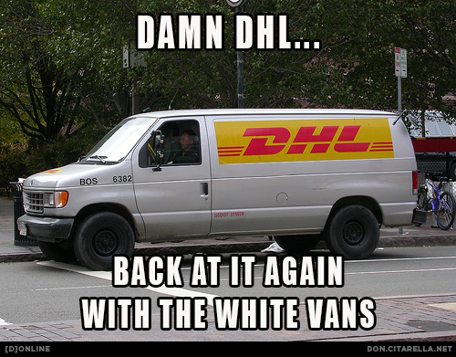
I gave up swearing for Lent, but thought this meme was too funny not to make while it was topical. Also, though biblical, is “damn” still considered a swear? I think a good deciding factor is whether or not Ellen says it on TV.
NYC Subway Art Collages
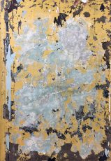
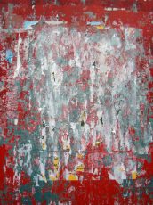
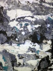
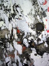
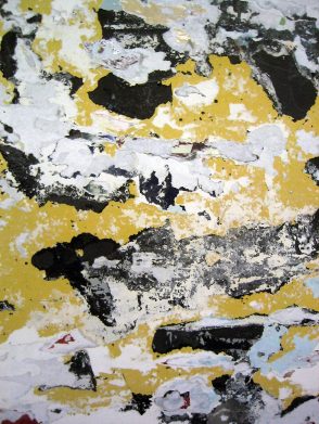
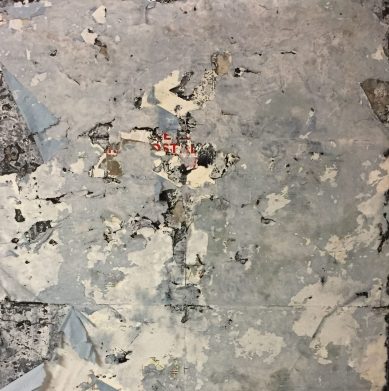
Nearly all subway stations have inlays in the tiled walls for advertising. For over a century, these inlays have been plastered with wheat-paste and posters were rolled on top, only to be shredded off, re-plastered, re-rolled, and re-shredded, again and again. The resulting collage of color in this accidental artwork is often quite compelling.
Over the last decade, whenever I encountered one I really enjoyed, I snapped a photo. Mostly, I just put these on my Flickr “Textures” gallery, or temporarily use it as the wallpaper on my phone. But recently, I’ve been thinking of printing/framing some of them and hanging them in my apartment or giving them to friends as gifts. What do you think? Leave a comment below or drop me a line if you’re interested.
Other [d]online “Art Collage” Posts:
January 24, 2009 — NYC Subway Art Collages
November 5, 2018 — NYC Wall Art Collages
David Zinn, Chalk Street Art
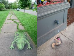
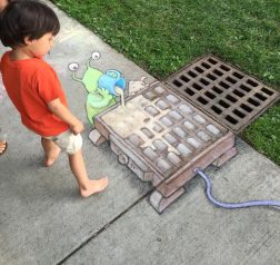
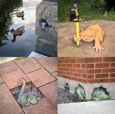
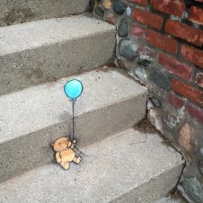
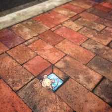
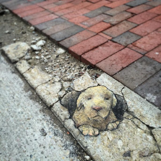
Michigan illustrator David Zinn has brightened the streets of Ann Arbor with his off-the-wall (or technically on-the-wall) chalk drawings since 1987. The artist works with chalk or charcoal to create site-specific artworks that usually incorporate surrounding features like cracks, street infrastructure, or found objects. Over the years he’s developed a regular cast of recurring characters including a bright green monster named Sluggo and a “phlegmatic flying pig” named Philomena.
Many of Zinn’s artworks are available as archival prints, and he recently published a new book titled Temporary Preserves. You can follow his almost daily street chalk adventures on Instagram and Facebook.
(via Colossal)
