When I left the house this evening, I didn’t plan on making my Friday night in Manhattan all about people watching. I’d hoped, rather, to be able to meet up with the latest girl that I’d been deluding myself about. But rather, in tune with the last few weeks of trying to see her, we never ended up together. In my head, I composed the perfect email to let her know we’re through, but delivery will wait until tomorrow morning (when I’m clear-headed). You lucky readers won’t get such a reprieve, but rather the unfiltered stream of consciousness that was my evening. Read more
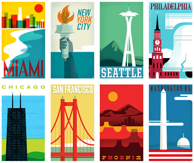
From Sea to Shining Sea
The Heads of State, the design and illustration studio of Jason Kernevich and Dustin Summers, put together this wonderful collection of travel posters. Each limited edition screenprint is 14 x 24 and, to me, more reminiscent of the old Penguin book covers than to traditional travel stamps. Regardless, I love them.

Attention CVS Pharmacy
Please learn the difference between the Caduceus and the Rod of Asclepius. Thank you.

This is my second biggest pet peeve behind people misspelling “stationery” in reference to the printed business system.
The Big Red Word vs. the Little Green Man
Special thanks to @ForwardMyMail for pointing out this wonderful article about iconography, image recognition, strategy in environmental design and international cultural differences. Many designers, myself included, deal with these arguments every day — though not specifically with exit signs. And these ideas are a source of not only a lot of headaches and heated discussions, but also rewarding and enjoyable.
Pete Goldlust
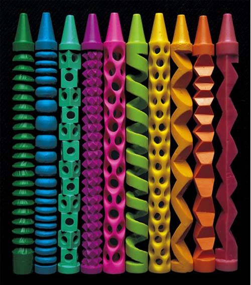
Artist’s statement: For several years, my work has explored a sculptural landscape where human urges (libidinous, predatory and monstrous) are acted out by half-recognizable, otherworldly surrogate creatures. The work reflects my interest in mutated, hybrid forms, and the disjunctive psychological states that they represent.
I’ve explored these themes using a variety of media. These have included traditional studio techniques, digital imaging, industrial manufacturing processes, and children’s arts-and-crafts materials. A sense of play is key to each of these creative strategies. For several years, the work has been largely focused on polymer clay sculpture.
Since 2005, I have worked with painter Julie Hughes to create collaborative mixed media installations that reflect our shared fascination with reconstituted, fragmented biomorphic form. Installations typically interweave Julie’s paintings on shaped sintra panels with my own polymer clay and mixed-media sculptures across a backdrop consisting of cut vinyl wall drawings. These environments explore the gray areas between seemingly distinct states of being: the alluring and the repulsive; the playful and the threatening; and the natural and the synthetic.
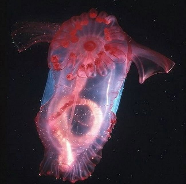
Sea Cucumbers
Found these photos of sea cucumbers online and was captivated by them. Perhaps this is where they got the inspiration for the aliens in the movie The Abyss.
Random Musings II
Due to the great success of Random Musings I (and I mean that facetiously), I’ve decided to continue through with a second one. I realize that ultimately, that turns [d]online into a tumblr, but I’ve never been one to adhere to a strict format and still feel myself wanting to get verbose sometime. Read more


