Bidding adieu to his last “real job” as Al Gore’s speechwriter, Dan Pink went freelance to spark a right-brain revolution in the career marketplace. In this TED TALKS lecture, he examines the puzzle of motivation, starting with a fact that social scientists know but most managers don’t: Traditional rewards aren’t always as effective as we think. Listen for illuminating stories — and maybe, a way forward.
ERA404 Relaunches ArthurAshe.org
Back in February of 2007, I worked with Jeanne Moutoussamy-Ashe to create the introduction and site tour for the Official Site of tennis legend, Arthur Ashe (“Honoring Ashe”). Since then, I’ve had the pleasure of designing/developing her personal photography site, a promotional video for Barack Obama, and other work. But this Spring, Ms. Moutoussamy-Ashe returned to request we redesign the complete ArthurAshe.org site (which was originally designed by Sean Lightner and the good folks at Merrill Lynch).
Take a look at the new site, here: www.arthurashe.org
And our 2007 press release: ERA404 Hired to Design Site for Tennis Legend, Arthur Ashe:
“ERA404’s team is young and energetic. They were good listeners and had the ability to grasp the needs of the client,” said Moutoussamy-Ashe. “I had a very pleasant experience.”
Strange Cargo
When I travel to far-off lands, I’m bemused by the oddity, the other-worldliness of ordinary grocery market shelves, where indigenous patrons must think I’m insane. I remember quite distinctly a flock (troupe? herd?) of Swiss interns—colleagues at my first dot-com gig out of college—marveling over an entire aisle of white bread. Personally, I thought they were verrückt. However when I spent a vacation in Bërn, I clearly couldn’t find one loaf of wonder bread at the nearest Coop or Migros. Read more
No Sleep til Breuckelen?
Someone recently laminated over “Brooklyn” on the 23rd St A/C/E Subway station entrance with the original name. An over-zealous Peter Stuyvesant fan? A shareholder in the Dutch West Indies Company? An Old Amsterdamian? Dunno. But what I love is that this “street art” actually prompts us to wiki. Now if that isn’t clever, ik weet niet wat er zou zijn.
tr.im goes out of business
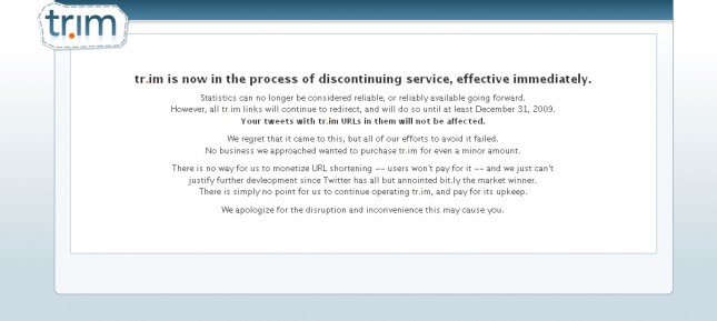
Without trying to sound too bitter about it, tr.im announced today that they’re no longer offering their services in the URL shortening war against bit.ly and TinyURL:
Statistics can no longer be considered reliable, or reliably available going forward.
However, all tr.im links will continue to redirect, and will do so until at least December 31, 2009.
Your tweets with tr.im URLs in them will not be affected.
We regret that it came to this, but all of our efforts to avoid it failed.
No business we approached wanted to purchase tr.im for even a minor amount.
There is no way for us to monetize URL shortening — users won’t pay for it — and we just can’t
justify further devleopment since Twitter has all but annointed bit.ly the market winner.
There is simply no point for us to continue operating tr.im, and pay for its upkeep.
We apologize for the disruption and inconvenience this may cause you.
It truly is unfortunate as I really liked their services with reporting and statistics, though the site was 90% visual fluff and the offering was otherwise no different from bit.ly or TinyURL. Now I just have to find a way to apologize to the clients that I recommended their services to.
NetworkSolutions Goes Backwards
One of most important parts of my job is to work with clients to make their designs simpler, cleaner and more intuitive. I take no greater pride than seeing the evolution of a print or web piece from a rough internal concept, riddled with arcane messages or esoteric ideas, to a clear, consistent promotion. I work with clients to meticulously hone down verbiage and copy to best communicate their offerings. Oftentimes, the back-and-forth discussion reveals even stronger concepts that prospective clients understand easier/faster and my clients marvel at the clarity of their image.
This is why I wonder what was going through NetworkSolutions’ minds when they recently redesigned their web site. It isn’t just the organization that suffers as they’ve transformed their image to look like every other registrar out there. They’ve also attempted to rebrand the products that each registrar sells (domains, sites , email accounts) with nsWebAddress™, nsSpace™ and nsMail™. Not only does this do nothing to increase customers’ understanding of their services, it also seems to be intentionally misleading. Hosting is commonly called “space” in the industry, however to NetworkSolutions, nsSpace™ is a web site, not web space. They’re no longer referring to SSL Certificates as the industry standard but rather nsProtect™. So when our clients go to manage their eCommerce accounts, and they want to buy or renew their certificates, they have no idea where to go or what to do. They may also, inadvertanly, let the renewal lapse because they’re not aware that nsProtect™ is a SSL Certificate. This is especially a problem when other registrars refer to private registration as Protection Services as it impedes Spambots from aggregating users’ private registration data.
 The complete list of their changes (the “most obvious” ones, they say) are to the left, listed under the guise of doing it in the name of customer requests. As if attempting to brand the most generic of registrar services, while also creating a whole host of new miscommunication/renewal issues, can be attributed to any customer request.
I have to wonder who coerced NetworkSolutions, a company already losing ground to registrars with less expensive services (Such as GoDaddy.com), to make their online presence so obscure that new customers could feasibly leave them when they don’t see “SSL Certificates” or “Domains” as products they even offer. It’s scenarios like this when I really become happy to work within a company that respects clarity of offering and strong, consistent communication to target audiences.
Flash Filter Hotspot Interference

I wasted almost an entire day this week attempting to figure out why a link started pulsing when activated by a mouse. The link, a 0% alpha “hotspot” or “rollbox” (as it’s sometimes called) movieclip (mouse enabled) with a dynamic textbox (mouse disabled), was listening for onRollOver and onRollOut mouse events. OnRollOver, the link was expected to switch indexes to the front, grow to 3x the original size and then ColorTransform to an active color. The index switch was updated immediately, and the scaleX/scaleY and ColorTransform was a timed action handled by Tweener. With the exception of the re-indexing, these tweens were triggered onRollOut as well, though in reverse. There are obviously a million other ways to handle this, and numerous tweening engines that could be used instead of Tweener, but this was the method I’d used in the past and was most comfortable with.
Upon testing, I found that most of the menu items worked fine, but some “pulsed” or flickered between growing and shrinking, as well as changing color sharply. Moving the mouse over the words while the tween was occurring sometimes seemed to thwart the issue. And some links seemed unaffected by the bug. Also, I noticed that when the link hit the onComplete method of the tween (meaning, it had finished growing to 300% and colorTransforming to the active state), the pulsing stopped.


