Map Portraits, by Ed Fairburn

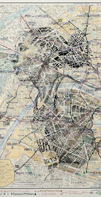
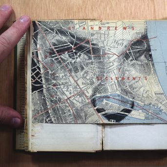
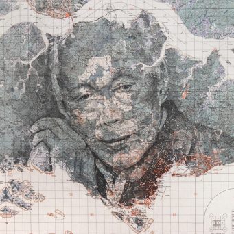
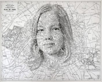
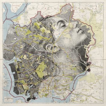
Along the contours of roads, property boundaries, and shorelines, English artist Ed Fairburn draws inspiration for his detailed cross-hatched portraits. As an avid map collector, he is fascinated by the urban landscape and cartographic design. “The more maps I collect, the more I want to create.”

You can find more of Fairburn’s work on his website, and follow updates on Instagram, where he often shares videos of his process.

(via @thisiscolossal)

NYC Wall Art Collages
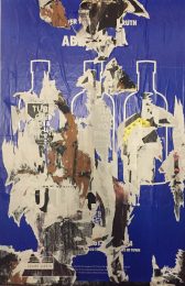
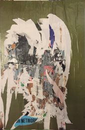
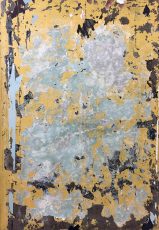
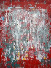
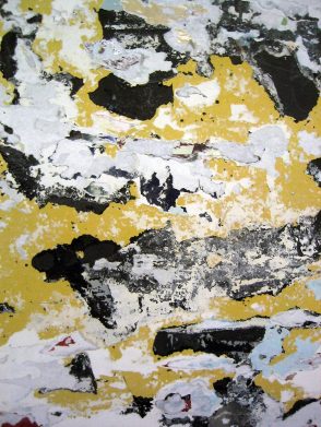
Many walls in NYC are designated for advertisements. The walls have been plastered with wheat-paste and posters are rolled on top, only to be shredded off, re-plastered, re-rolled, and re-shredded, again and again. The resulting collage of color in this accidental artwork is often quite compelling.

For the greater part of two decades, whenever I encountered one I really enjoyed, I snapped a photo. Mostly, I just put these on my Flickr “Textures” gallery, or temporarily use it as the wallpaper on my phone. But recently, I’ve been thinking of printing/framing some of them and hanging them in my apartment or giving them to friends as gifts. What do you think? Leave a comment below or drop me a line if you’re interested.

Other [d]online “Art Collage” Posts:
January 24, 2009 — NYC Subway Art Collages
March 11, 2016 — NYC Subway Art Collages
The Art Institute of Chicago Public Domain Collection

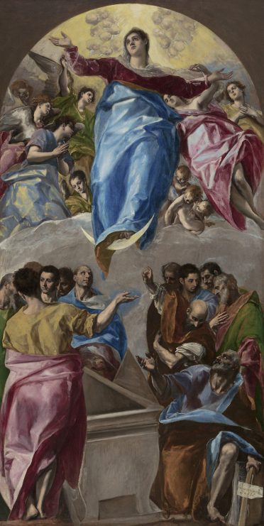
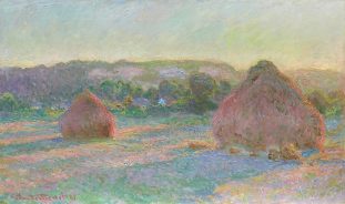
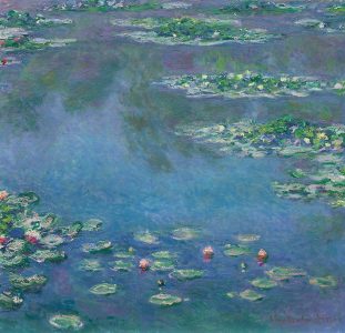
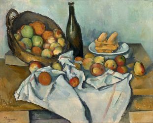
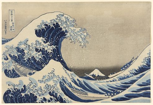
The Art Institute of Chicago has announced a redesign of its website, which entails the opening of its digital archive to the masses. Now, anyone will be able to download, print, or use its new public domain collection of 52,438 artworks and counting. Read more

NYC Subway Art Collages

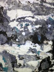
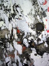
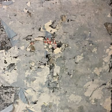
Nearly all subway stations have inlays in the tiled walls for advertising. For over a century, these inlays have been plastered with wheat-paste and posters were rolled on top, only to be shredded off, re-plastered, re-rolled, and re-shredded, again and again. The resulting collage of color in this accidental artwork is often quite compelling.

Over the last decade, whenever I encountered one I really enjoyed, I snapped a photo. Mostly, I just put these on my Flickr “Textures” gallery, or temporarily use it as the wallpaper on my phone. But recently, I’ve been thinking of printing/framing some of them and hanging them in my apartment or giving them to friends as gifts. What do you think? Leave a comment below or drop me a line if you’re interested.

Other [d]online “Art Collage” Posts:
January 24, 2009 — NYC Subway Art Collages
November 5, 2018 — NYC Wall Art Collages
Copies of a Copy

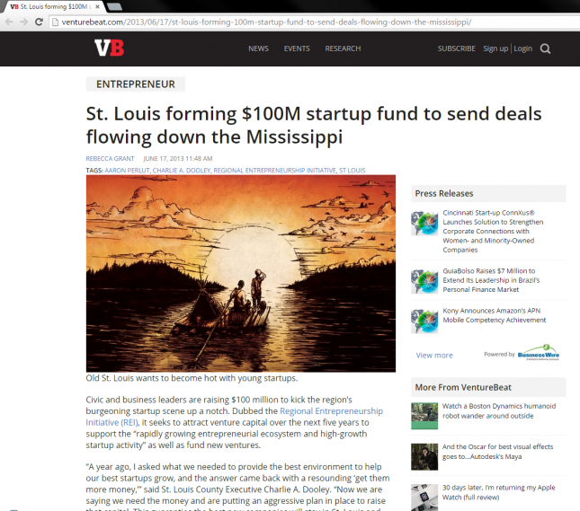
In 2007, an investment firm hired my studio, ERA404, to design an “Indiana Jones diary” for a global investor, as a unique way of showcasing their findings from a literacy study they conducted. Part of the project was creating a dozen or so original illustrations from his travels. One of the illustrations was of Huckleberry Finn rafting down the Mississippi River. I confess that I borrowed inspiration from an iconic book cover when creating the artwork.

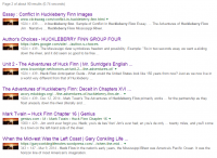
"Huck Finn River" Google Search ResultsA few weeks ago, a friend and colleague pointed my attention to an article on VentureBeat.com which incorporated a cropped version of this illustration. On a whim, I did a Google Image Search, and was able to find that this image has been reproduced, re-cropped, and re-used in 8 pages and 90 links worth of results, making it one of the most frequently returned images in Google searches with the keywords “huck finn river”.

Read more

Huckleberry Finn Illustration

Huckleberry Finn Illustration

Guess someone liked my Huckleberry Finn illustration for the Global Investment Literacy client so much, they decided to use it (without mention or credit) on VentureBeat. I suppose plagiarism is the sincerest form of flattery.

See the finished book and all illustrations for this project in the ERA404 portfolio. Follow me @citarella and @era404 on Twitter.

Special thanks to @todd_greene for finding and sharing the link.

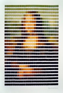
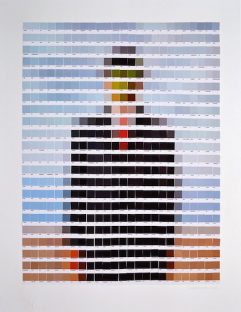
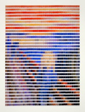
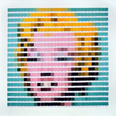
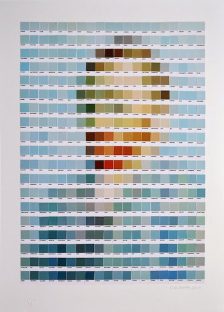
Artistic masterpieces rendered in Pantone swatches

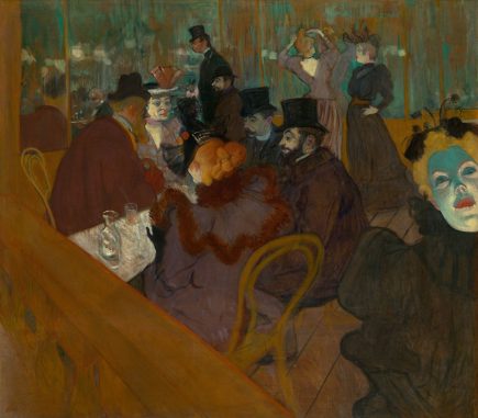
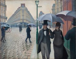
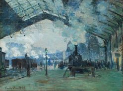
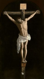
Just the other day, Pantone named Marsala the color of 2015, and the decision, er, “has critics seeing red.” The only thing that gets art and design people more worked up than Pantone swatches is the rampant overuse of Comic Sans. Art and design people LOVE Pantone. … thus it was inevitable that someone would do what London artist Nick Smith did, and create quasi-“pixelated” versions of famous art masterpieces, only using Pantone swatches.

Smith currently has an exhibition called “Psycolourgy” at the Lawrence Alkin Gallery near Covent Garden. The show runs through February 20.

(via Dan and dangerousminds.net)