Take a look at this beautifully meticulous, hand-crafted paper alphabet by Sabeena Karnik, a caligrapher, fine artist and illustrator/ typographer specializing in paper sculpturing and acrylic murals.
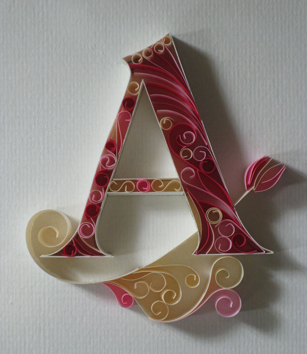
Take a look at this beautifully meticulous, hand-crafted paper alphabet by Sabeena Karnik, a caligrapher, fine artist and illustrator/ typographer specializing in paper sculpturing and acrylic murals.

This week, I was delighted to learn from a few separate sources that [d]online was featured on the MyFonts.com home page. I have to assume that this coveted real estate is reserved for fonts that portray their catalog in a positive light and feel honored that they selected one of my typefaces to do so. I’m hoping that my second font, era404 Regular, will pop-up there at some point too.
Since August 2010, [d]online Medium has been downloaded 13,643 times on dafont.com. Since January 2011, era404 Regular has been downloaded 7,619 times. And as I watched these numbers continue to rise, a collective 21,000 downloads of my typefaces, I began to wonder if people were only downloading them because they were free or if people liked them enough to spend some money on them.
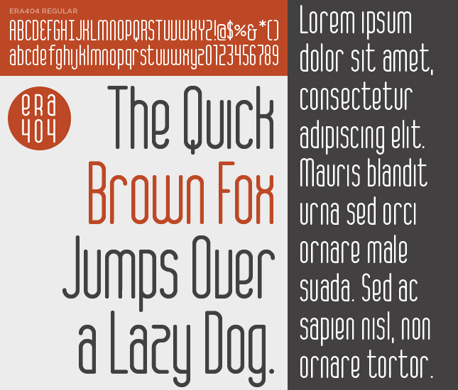
In light of my design studio’s new branding initiative, and based on some positive feedback about the lettering, I decided to expand the logo into a whole typeface. The font, which contains 256 glyphs and ligatures, is called era404 Regular and can be downloaded from MyFonts.com (along with my previous font, [d]online). Please only use it for personal use. Contact me (or post a comment) if you’re interested in commercial licensing of either typeface. And as always, I’d love your feedback.
Below are Font Shop’s Top 100 Fonts of Al Time, as rated by an international jury. If I have time and/or motivation, I’d link each of these. Sadly, at this point in my life, I do not.
Rank | Font Name | [Date Designed – Designed By]
1. Helvetica [1957 – Max Miedinger]
2. Garamond [1530 – Claude Garamond]
3. Frutiger [1977 – Adrian Frutiger]
4. Bodoni [1970 – Giambattista Bodoni]
5. Futura [1927 – Paul Renner]
6. Times [1931 – Stanley Morison]
7. Akzidenz Grotesk [1966 – Günter Gerhard Lange]
8. Officina [1990 – Erik Spiekermann]
9. Gill Sans [1930 – Eric Gill]
10. Univers [1954 – Adrian Frutiger]
11. Optima [1954 – Hermann Zapf]
12. Franklin Gothic [1903 – Morris Fuller Benton]
13. Bembo [1496 – Francesco Griffo]
14. Interstate [1993 – Tobias Frere-Jones]
15. Thesis [1994 – Lucas de Groot]
16. Rockwell [1934 – Frank H. Pierpont]
17. Walbaum [1800 – Justus Walbaum]
18. Meta [1991 – Erik Spiekermann]
19. Trinité [1982 – Bram De Does]
20. Din [1926 – Ludwig Goller]
21. Matrix [1986 – Zuzana Licko]
22. OCR [1965 – American Type Founders]
23. Avant Garde [1968 – Herb Lubalin]
24. Lucida [1985 – Chris Holmes / Charles Bigelow]
25. Sabon [1964 – Jan Tschichold]
26. Zapfino [1998 – Hermann Zapf]
27. Letter Gothic [1956 – Roger Roberson]
28. Stone [1987 – Summer Stone]
29. Arnhem [1998 – Fred Smeijers]
30. Minion [1990 – Robert Slimbach]
31. Myriad [1992 – Twombly & Slimbach]
32. Rotis [1988 – Olt Aicher]
33. Eurostile [1962 – Aldo Novarese]
34. Scala [1991 – Martin Majoor]
35. Syntax [1968 – Hans Eduard Meier]
36. Joanna [1930 – Eric Gill]
37. Fleishmann [1997 – Erhard Kaiser]
38. Palatino [1950 – Hermann Zapf]
39. Baskerville [1754 – John Baskerville]
40. Fedra [2002 – Peter Bil’ak]
41. Gotham [2000 – Tobias Frere-Jones]
42. Lexicon [1992 – Bram De Does]
43. Hands [1991 – Letterror]
44. Metro [1929 – W. A. Dwiggins]
45. Didot [1799 – Firmin Didot]
46. Formata [1984 – Bernd Möllenstädt]
47. Caslon [1725 – William Caslon]
48. Cooper Black [1920 – Oswald B. Cooper]
49. Peignot [1937 – A. M. Cassandre]
50. Bell Gothic [1938 – Chauncey H. Griffith]
51. Antique Olive [1962 – Roger Excoffon]
52. Wilhelm Klngspor Gotisch [1926 – Rudolf Koch]
53. Info [1996 – Erik Spiekermann]
54. Dax [1995 – Hans Reichel]
55. Proforma [1988 – Petr van Blokland]
56. Today Sans [1988 – Volker Küster]
57. Prokyon [2002 – Erhard Kaiser]
58. Trade Gothic [1948 – Jackson Burke]
59. Swift [1987 – Gerald Unger]
60. Copperplate Gothic [1901 – Frederic W. Goudy]
61. Blur [1992 – Neville Brody]
62. Base [1995 – Zuzana Licko]
63. Bell Centennial [1978 – Matthew Carter]
64. News Gothic [1908 – Morris Fuller Benton]
65. Avenir [1988 – Adrian Frutiger]
66. Bernhard Modern [1937 – Lucian Bernhard]
67. Amplitude [2003 – Christian Schwartz]
68. Trixie [1991 – Erik van Blokland]
69. Quadraat [1992 – Fred Smeijers]
70. Neutraface [2002 – Christian Schwartz]
71. Nobel [1929 – Sjoerd de Roos]
72. Industria [1990 – Neville Brody]
73. Bickham Script [1997 – Richard Lipton]
74. Bank Gothic [1930 – Morris Fuller Benton]
75. Corporate ASE [1989 – Kurt Weidemann]
76. Fago [2000 – Ole Schafer]
77. Trajan [1989 – Carol Twombly]
78. Kabel [1927 – Rudolf Koch]
79. House Gothic 23 [1995 – Tal Leming]
80. Kosmik [1993 – Letterror]
81. Caecilia [1990 – Peter Matthias Noordzij]
82. Mrs Eaves [1996 – Zuzana Licko]
83. Corpid [1997 – Lucas de Groot]
84. Miller [1997 – Matthew Carter]
85. Souvenir [1914 – Morris Fuller Benton]
86. Instant Types [1992 – Just van Rossum]
87. Clarendon [1845 – Benjamin Fox]
88. Triplex [1989 – Zuzana Licko]
89. Benguiat [1989 – Ed Benguiat]
90. Zapf Renaissance [1984 – Hermann Zapf]
91. Filosofia [1996 – Zuzana Licko]
92. Chalet [1996 – House Industries]
93. Quay Sans [1990 – David Quay]
94. Cézanne [1995 – Michael Want, James Grieshaber]
95. Reporter [1938 – Carlos Winkow]
96. Legacy [1992 – Ronald Arnholm]
97. Agenda [1993 – Greg Thompson]
98. Bello [2004 – Underware]
99. Dalliance [2000 – Frank Heine]
100. Mistral [1953 – Roger Excoffon]
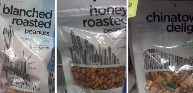
It isn’t the first time people have incorporated bar codes into the design of things. In fact, I believe I saw three different periodical covers last year that used this same technique. So the concept is far from original.
But Duane Reade—which, to New Yorkers, is synonymous with pharmacy—recently took this one step further by working their product bar codes into iconic metropolitan imagery. The Chinatown Delight—which I always thought was either a extra surprise at the end of a massage, or the revelation that she’s both my daughter and my sister (Don’t get my reference? Then forget it, Jake, it’s Chinatown)—uses a subway train. The Honey Roasted Peanuts uses a NYC cityscape. The Blanched Roasted Peanuts uses the Statue of Liberty. So while the imagery and concept are New York at it’s tritest, the integration of both the bar code and symbolism into the main graphic elements on this packaging makes it pretty unique and beautiful.
Turns out Michael Mann, the Director of ‘Public Enemies’, is a control freak perfectionist in every area of crafting a movie….. that’s a compliment by the way.