Emanuele Abrate illustrates the typefaces used in some of the most famous brands.
typography
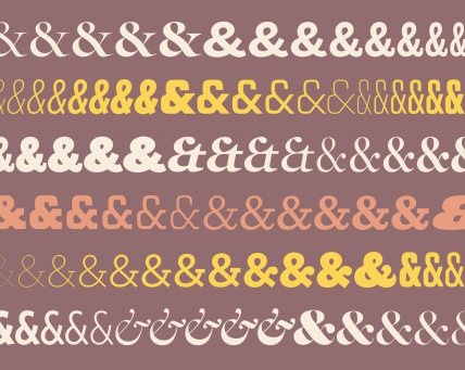
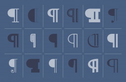
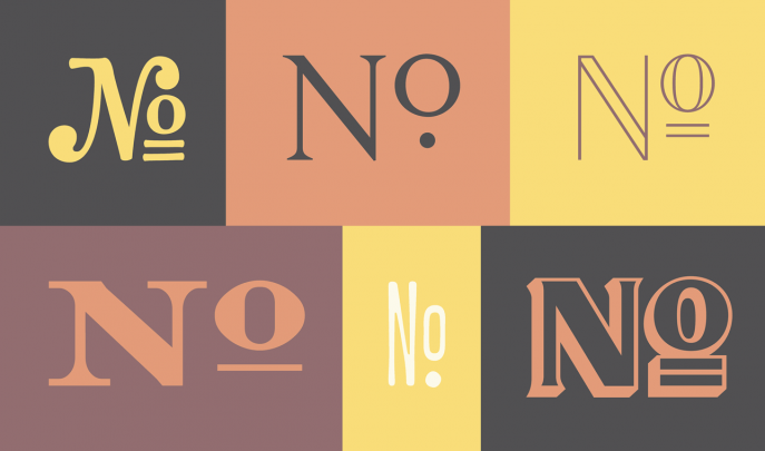
Mysteries & Subtleties, by Hoefler & Co.
The back acreage of a typeface conceals some of its greatest treasures, and tells some of typography’s most fascinating stories. Meet four typographic curios on which the designers at H&Co love to lavish special attention, and learn how these piquant spices can help turn up the flavor of your design.
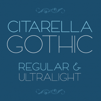
Citarella Gothic Regular
I’m happy to announce that Citarella Gothic Regular is available for download at MyFonts.com. Thanks to everyone for the kind words and encouragement since I released Citarella Gothic Ultralight back in January. Your support (and purchases) has really been a tremendous help in pushing this project forward. Thank you!
The History of Typography
httpv://www.youtube.com/watch?v=wOgIkxAfJsk
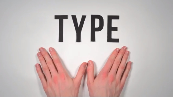
A paper-letter animation about the history of fonts and typography. 291 Paper Letters. 2,454 Photographs. 140 hours of work.
This is Calibre
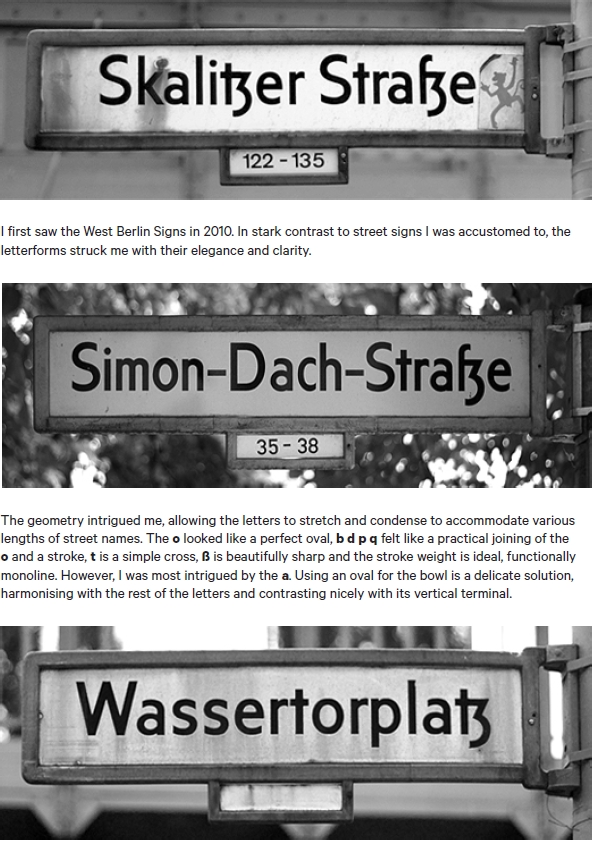
I really enjoyed reading the supporting documentation of Kris Sowersby’s Calibre typeface, “sired by West Berlin street signs” and “inspired by the rationality of Aldo Novarese’s seldom seen Recta“. Above is one such page from the documentation, which can be downloaded,here.
Live Happily Ever Now
My new design for a friend’s tattoo has been featured on The Daily Glyph. The design is an homage to Herb Lubalin and based roughly on the font Antique Ancienne (note his studio logo, at that link).
Dave Smith’s “Born and Raised” Album Artwork
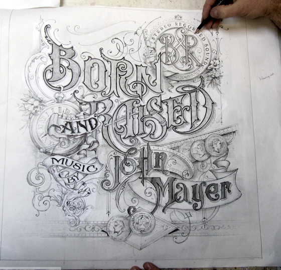
Smith: “Working with John on the brief of the artwork, he asked me to include coins, watches, flowers, and ribbons. I had a great start because of his direction and experience in graphic design and knew this would go smoothly. He also has a great eye for detail and design.”
