


Emanuele Abrate illustrates the typefaces used in some of the most famous brands.
Emanuele Abrate illustrates the typefaces used in some of the most famous brands.


As designers and typographers, it’s always heart-warming to see our work in use. Spotting my font family, Citarella Gothic, always makes me happy. This Sunday, I had the added enjoyment of seeing two weights of the typeface created in metal for the Park Francis in Hamilton Park, Jersey City. As far as I can tell, the logo and signage was created by Chris Rudloff of New World Group in Secaucus, New Jersey.
The back acreage of a typeface conceals some of its greatest treasures, and tells some of typography’s most fascinating stories. Meet four typographic curios on which the designers at H&Co love to lavish special attention, and learn how these piquant spices can help turn up the flavor of your design.


The third weight of the Citarella Gothic family is now available on MyFonts.


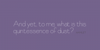
I’m happy to announce that Citarella Gothic Regular is available for download at MyFonts.com. Thanks to everyone for the kind words and encouragement since I released Citarella Gothic Ultralight back in January. Your support (and purchases) has really been a tremendous help in pushing this project forward. Thank you!


I’m happy to announce that Citarella Gothic Ultralight is officially on-sale at MyFonts. Here’s the description:
About Citarella Gothic:
In seeking a strong, utilitarian gothic alternative for Helvetica, we’re left with few options for unobtrusive functionalism. As such, I decided to create the Citarella Gothic family. The ligatures are characteristic of the signage and architecture around Sarno, Italy, where the Citarella family originates. The sweeping arcs, broad counters, and clean swashes allow for the architectural design to be imbued with the warmth and humanity of its namesake.
Over time, I hope to extend the family to other weights and styles, but decided to start with the ultralight version and work my way through black. In the meantime, visit MyFonts.com to play around with the font. Your feedback is appreciated, as is, of course, your patronage.
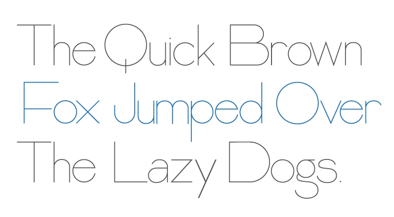
This is the beginning of a new type family that I’m working on, tentatively titled Citarella Gothic. I’m beginning with the Ultralight variant (seen above) and will be working through Black. I’d originally liked the idea of calling the font Citra, but a cursory Google search reveals there are already a number of brand names associated with Citra, so I may default to my last name. After all, I already have fonts named after this blog and my company, so why not create an eponymous one?*
The sizing and kerning are very rough, though your thoughts and feedback are certainly appreciated. Incidentally, here‘s a homework assignment from kindergarden my mom found in our basement. Apparently, I was designing fonts at Age 5.
* It’s not egoism if Francois Didot, Claude Garamond, Nicolas Jenson, Lucian Bernhard, Hermann Zapf, Giambattista Bodoni, Adrian Frutiger, John Baskerville, William Caslon, Eric Gill, Ed Benguiat, Frederic Goudy, and Herb Lubalin all did it.