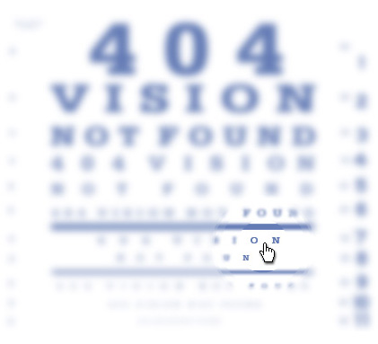
• About
  • Verse
  • Code
  • Sketch
  • Pix
  • Blog
Donline: The Personal Blog of Don Citarella

SwissMiss Minimalism


Tina Roth-Eisenberg’s updated Minimalism Gallery.
By God this girl is talented.
>> See it here.

June 19th, 2006 by Don Photography, NewsNo Comments

Textures

 
Refined my Flickr Texture Gallery to incorporate textures from Mallorca.
>> See them here.

June 19th, 2006 by Don PhotographyNo Comments

Venice

“So this is Venice” my mom said quite innocently as we faced the Scalzi Bridge in 1999. I envied her passion and the unrepenting excitement in her voice.

When I was a kid, my mom told me about a magical city where the streets were made of water. She said that one day when I was older, I would need to visit the fabled Venice before it slipped into the ocean and was lost for good. Venice was a modern-day Atlantis, to me, and I had precious little time to catch it before it was gone.

Read the rest of this entry »

June 19th, 2006 by Don PhotographyNo Comments

Impactive vs. Cathartic

So I was sitting with a client who was attempting to discribe to me the different qualities that they wanted their new identity system to embody. When we work with companies seeking new identities, or upgrades to their existing one, I often tell them that the adjectives they use to describe themselves and their businesses are what they should use to describe their identity. This way, the identity would promote the proper message.

For example, if we are working on an identity system and branding campaign for a bank, clients consistently say that they want their business to be seen as “trusted,” “conservative” and “friendly.” In the same way, their identity should relate those qualities. If we’re working on a web site for a new product for kids, the client could tell us that they want it to be “fun,” “energetic” and “memorable.” Though all sites (in theory) should be memorable, this is the message that should be transmitted visually when someone browses to their site.

Anyway, I asked the client to fill out our ten questions form, which has this as the first question, and they couldn’t think of a third option. But they did write down that they want their identity system to be “impactive” and “cathartic.”

I should say at this time that while I won’t reveal the identity of our client, they were in the business of helping other companies to perform a task in Human Resources. Don’t go trying to scour our portfolio for the client, I assure you they’re not in there.

Well, the literal translation of “impactive” is tied closer to “impacted” (like an impacted bowel) than “impactful” (to fix firmly by or as if packing or wedging). The literal translation of “cathartic” is inducing catharsis; purgative. It is also an agent for purging the bowels, especially a laxative.

So, literally, the client wanted their identity (and the identity of their new company) to be both constipating and a laxative.

Needless to say, I was confused as to whether the logo should hold it in or force it out, and knew that in the end, with this criteria in mind, the identity would come out looking like shit either way.

It wasn’t until I prodded the client to come up with a third adjective that I started to think there was an issue with his psyche. He said “well, I’m pretty meticulous about all the details of my industry, so i guess you could say, I’m anal-retentive.”

At this point, I’m looking for Ashton to pop out and proclaim that I’ve been Punk’d. But he seemed to be quite serious. And whether he’s anal retentive or expulsive, I still have no clue where to start with this logo. I’m imaging that recent ad for Sudden Urinary Incontinence (SUI) that I saw on TV with the walking pipe people chasing butterflies on a picnic and phrases from other freelance rich media gigs (”Sometimes I’m afraid to laugh because I’m worried something may come out…”) come to mind, and then it dawns on me.

This client, who may or may not be stuck in their Freudian Anal Stage, wants to evoke feelings of comfort and safety. They want their clients to feel the gratification that toddlers feel when their 2-3 years old over having control over something (albeit not their sphyncters).

The final identity became something close to a pressure valve constructed creatively by using the client’s initials and company name. They saw the final piece and loved it.

To sum up, the logo ended up (as I suspected) looking like shit. But in a good way.

August 15, 2006—The icing on the proverbial cake. I just received this client’s literature in the mail and had to smile. They added the tagline to the front page of their brochure “Making Human Resources Run Smoothly”.
June 10th, 2006 by Don News2 Comments
  • Categories

    • Code Examples (11)
    • Illustrations (5)
    • Journal Entries (23)
    • News (111)
    • Photography (23)
    • Poetry (11)
    • Prose (5)
    • Sketches (8)
  • Archives

    • May 2008
    • April 2008
    • March 2008
    • February 2008
    • January 2008
    • December 2007
    • November 2007
    • October 2007
    • September 2007
    • August 2007
    • July 2007
    • June 2007
    • May 2007
    • April 2007
    • March 2007
    • February 2007
    • January 2007
    • December 2006
    • November 2006
    • October 2006
    • September 2006
    • July 2006
    • June 2006
    • April 2006
    • March 2006
    • January 2006
    • June 2005
    • April 2005
    • February 2005
    • September 2004
    • February 1999
    • January 1999
    • December 1997
  • Links

    • era//404 Creative Group, Inc.
    • SwissMiss
    • Fischler.org
    • Picture Calendar
    • My Flickr Page
    • My MySpace Link
    • My Friendster Page
    • My Faceparty Link
    • Citarella.net
    • Venice
    • Spain
    • France, Switzerland, Germany
    • England
    • Ireland
    • Fuse Number 8
    • My Facebook Page
    • My Maddened Mind
  • Meta

    • Login
    • Valid XHTML
    • XFN
    • WordPress

Copyright © 2006 donline. All Rights Reserved.
Entries (RSS), Comments (RSS). Valid XHTML, CSS. Proudly powered by WordPress