Take a look at this beautifully meticulous, hand-crafted paper alphabet by Sabeena Karnik, a caligrapher, fine artist and illustrator/ typographer specializing in paper sculpturing and acrylic murals.
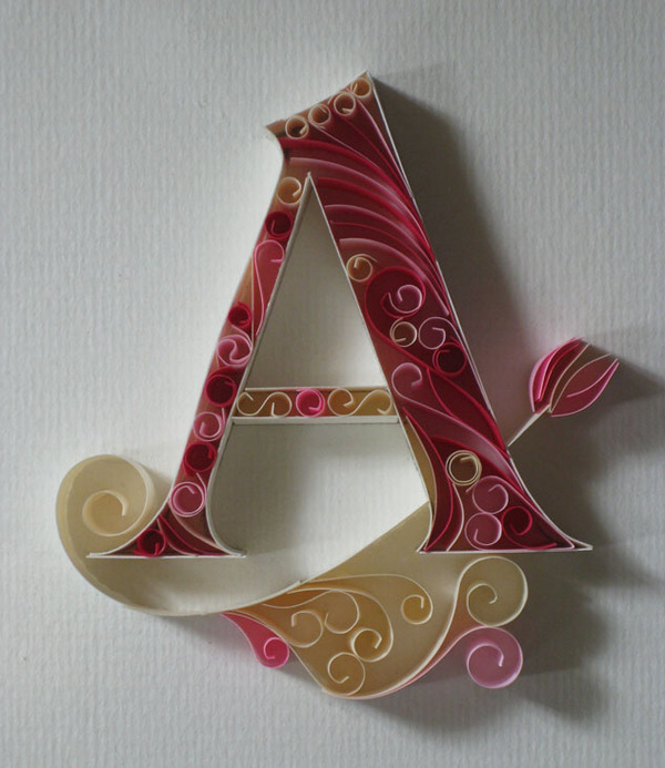
Take a look at this beautifully meticulous, hand-crafted paper alphabet by Sabeena Karnik, a caligrapher, fine artist and illustrator/ typographer specializing in paper sculpturing and acrylic murals.

This week, I was delighted to learn from a few separate sources that [d]online was featured on the MyFonts.com home page. I have to assume that this coveted real estate is reserved for fonts that portray their catalog in a positive light and feel honored that they selected one of my typefaces to do so. I’m hoping that my second font, era404 Regular, will pop-up there at some point too.

Since August 2010, [d]online Medium has been downloaded 13,643 times on dafont.com. Since January 2011, era404 Regular has been downloaded 7,619 times. And as I watched these numbers continue to rise, a collective 21,000 downloads of my typefaces, I began to wonder if people were only downloading them because they were free or if people liked them enough to spend some money on them.

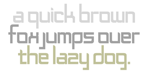
In light of my design studio’s new branding initiative, and based on some positive feedback about the lettering, I decided to expand the logo into a whole typeface. The font, which contains 256 glyphs and ligatures, is called era404 Regular and can be downloaded from MyFonts.com (along with my previous font, [d]online). Please only use it for personal use. Contact me (or post a comment) if you’re interested in commercial licensing of either typeface. And as always, I’d love your feedback.
Two quick things in reference to my new [d]online typeface.
1. American Typographers: According to this site, put together by Luc Devroye, of the School of Computer Science at the esteemed McGill University in Montreal, I’m part of the American Type Scene and featured (less than prominently) on his New York City page:
 (by the way, the French example translates to “On the lap of the sorceress”)
2. MyFonts: I’m now listed on myfonts.com:

In light of the creation of [d]online, the font, and my recent post about The League of Moveable Type (to which [d]online was submitted), I did some poking around and found their new Social Font Manager, the Lettercase Application. Apparently, this application will enable like-minded typographers to collaboratively build typefaces. And, to this typophile and amateur typographer, with marginal ligature skills and a lack of patience for kerning, this is wonderful news.
