My design studio, ERA404 Creative Group, was pleased to launch our 2011 Creative Reel this week. Information about the reel can be found in the supplementary ERA404 newsletter (Season X, Issue II), the Press Release (ERA404: Commemorating10 Years) as well as the [d]online blog post about the rebranding effort.
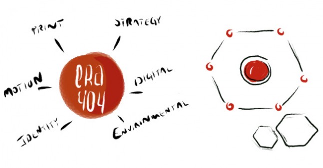
In the rebranding post, you will learn about the creation of the six disciplinary icons, each of which is based on outward growth from a circle that ultimately creates the icon/discipline. ERA404‘s new logo has been placed into a circle to visually position ourselves as the origin of this growth for our clients. In the press release and newsletter, you can learn that the incorporation of these six icons into our rebranding initiative is, in part, an attempt to correct the public conception that era404 only provides web services. Using these six icons consistently (in posts, stationery, newsletters, portfolio pieces, etc.) helps to communicate the facets of design and development that we’ve contributed to each project and client we engage.
![]()
The last piece of the puzzle is to, again, repeat the theme of era404 (and our work) being at the hub of the project, and each discipline radiating out of the center, similar to spokes on a wheel. This not only reinforces the theme of growth from the center/origin of the circle/project, but also illustrates the multi-disciplinary nature of the studio. A client selects era404 to grow out their identity, but may continue to work with us to establish a print campaign, build an online presence, design the environment for trade shows, etc.

In the new reel, this idea is reinforced in different ways. The first technique shows the logo is comprised of this new hexagonal element (with each discipline on an interconnecting node):

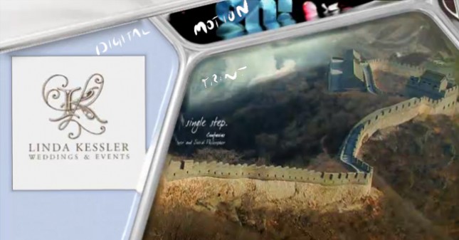
The pieces within the reel are separated by sides of the hexagon to differentiate between the disciplinary work we provided for each project. The structure of the hexagon bifurcates the different types of work we provided for each client (as Digital, Motion and Print in the example below):

But they also encapsulate singular pieces when we provided all six types of work for a specific client (as in the example of First Funds, below):

The positive reaction to the reel has already proven that the initiative has been successful in promoting era404 as a multi-disciplinary studio and we’ve received calls and emails from former (and existing) clients that were eager to learn how we can help with other areas of design and development, beyond the work we’ve completed for them in the past.
Overall, the process was quite educational and incredibly gratifying. The growth of the studio over the last decade has been unprecedented and our goal of engaging with clients—businesses seeking a team to create and manage more than just one part of their design needs—is better communicated with this new identity and branding effort.
If you have feedback on the new identity, the reel or the strategy in general, I’d love to hear it. Drop me a comment below, on Google+, Twitter, Linked In, Facebook or through era404.com. Thank you for your continued support and patronage throughout the years and I look forward to working with you in the future.