Design
Duane Reade’s New York Packaging
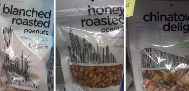
It isn’t the first time people have incorporated bar codes into the design of things. In fact, I believe I saw three different periodical covers last year that used this same technique. So the concept is far from original.
But Duane Reade—which, to New Yorkers, is synonymous with pharmacy—recently took this one step further by working their product bar codes into iconic metropolitan imagery. The Chinatown Delight—which I always thought was either a extra surprise at the end of a massage, or the revelation that she’s both my daughter and my sister (Don’t get my reference? Then forget it, Jake, it’s Chinatown)—uses a subway train. The Honey Roasted Peanuts uses a NYC cityscape. The Blanched Roasted Peanuts uses the Statue of Liberty. So while the imagery and concept are New York at it’s tritest, the integration of both the bar code and symbolism into the main graphic elements on this packaging makes it pretty unique and beautiful.
When you think “Don,” think “Public Toilets”

On a recent trip to Arthur’s Steaks in Hoboken, I noticed something funny in their restroom. The soap, paper towel and toilet paper dispensers all had my name on them.
I Love Dust
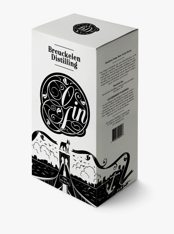
I really enjoy the product design work by I Love Dust. Take a look at the packaging for Breuckelen Distilling, a Brooklyn-based distillery, below.
Vector Scrollbars
 I consistently needed a standard vector scrollbar for the browser in UI/UX mock-ups in Adobe Illustrator as I got tired of creating screenshots and tweaking lengths in Photoshop. If you do, too, grab this zip. It includes the CS4 .AI, .EPS and .PDF version of both the horizontal and vertical scrollbar. You’re welcome. I’m also thinking that someday it might be beneficial to create a vector version of the mouse hand and arrow, though I’m debating whether I should keep the stair-stepping of pixelation at that size, and how best to handle the drop shadows. If anyone has a suggestion, let me know what you think.
The Big Red Word vs. the Little Green Man
Special thanks to @ForwardMyMail for pointing out this wonderful article about iconography, image recognition, strategy in environmental design and international cultural differences. Many designers, myself included, deal with these arguments every day — though not specifically with exit signs. And these ideas are a source of not only a lot of headaches and heated discussions, but also rewarding and enjoyable.
