Web
2011 – The Year Everything Changed at FWA
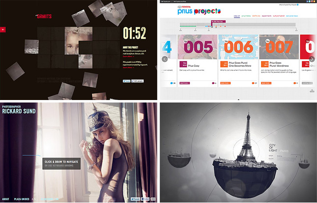
Up until February 2007, FWA had almost entirely been awarding Flash websites. For 7 years, every day, a new Site Of The Day (SOTD) was being announced and it was always, almost completely, Flash deployed. The team at Ogilvy Singapore changed everything when they submitted Levi’s Copper Jeans and it went on to win SOTD on 21st February 2007. This site still stands shoulder to shoulder with the best non-Flash sites of 2011 and will always stand out as the seed of change at FWA.
For the next three years we saw the occassional plugin free site win an FWA but in 2010, the playing field was destroyed when The Wilderness Downtown landed on the FWA judges. The interactive short film immediately earned its place in FWA history as it went on to win Site Of The Year (SOTY) for 2010. Whilst raising a lot of eyebrows amongst some of FWA’s hardcore fans, I know personally and amongst the judges for SOTY that there was no doubt that Arcade Fire’s “We Used to Wait” promo site had raised the bar to a level we were not quite expecting.
2011… when everything REALLY DID change at FWA
The do’s and don’ts of Flash
This article was originally published on the Firstborn site on July 1, 2011, and is written by my buddy and Flash guru, Zeh Fernando:
 The do’s and don’ts of Flash
Zeh Fernando, senior developer at Firstborn, rounds up the ultimate do’s and don’ts of Flash to explain how we can improve our workflow to create powerful, rich online experiences more efficiently.
Developing fully interactive websites is an amazing experience whose technology is in a current state of change. We’re not only seeing big changes in terms of platforms used for that purpose – HTML5 anyone? – but also in the workflow employed when developing those (so called) rich websites.I think that Flash is a particularly acute example of the latter. The platform has evolved a lot through the years, not only in regards to what it can do, but in how one should do it. In that sense, the rich online experiences we create can now be more powerful than ever, so here’s a few pointers on how to get it done a little more efficiently.
Read more…
Google+ and +1
Plus One
The +1 thing has been a part of the internet for as long as I can remember. Stemming back from my early days on shockfusion.com, the best way for someone to give propz where propz were due, with a system that didn’t allow for it, was to simply post a reply with “+1” in it. QBN.com (formerly NewsToday.com) added that mechanism to their home page for visitors to promote admin- and user-added content. And now Google has wholly embraced he meme with their version of Facebook’s erroneously-named “Like” button. So what’s the main difference between Facebook’s “Like” button and Google’s “+1” button? The answer is simple: Google has a search, Facebook does not. +1ing, though not guaranteed, will help improve your pages’ rank and elevate its placement among Google search results. It’s pretty much the Digg.com model, but for all teH InterWebz, not just news.
You may also notice the shiny, new +1 button on [d]online’s header, by the search bar. G’head and click it if the spirit moves you.
Google+
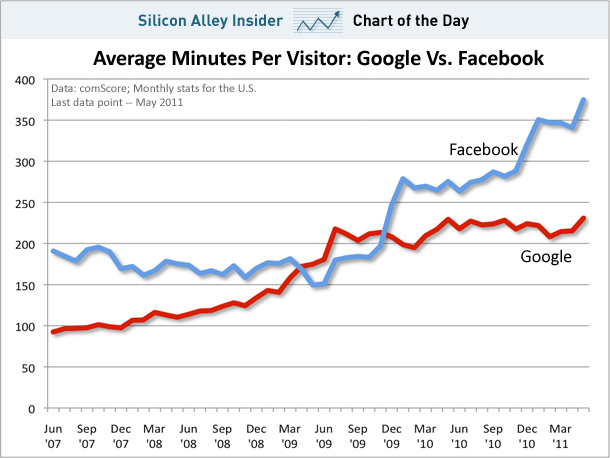
Now, Google has taken their war against Facebook domination to the next level. How? They’ve launched their own Facebook with Google+. According to them, they did it because “People Hate Facebook.” And within days of the launch, all my friends, coworkers and family members seem to be scrambling into their “circles” (Google’s version of Facebook’s “lists”) and posting up a storm. Facebook says that they knew about circles last year and beat Google to market by launching their rehashed version of Facebook Groups (though, I believe, they’re are as pointless as Google Groups – which I still use and manage). But Google is really banking on Google+’s success. And they need to, as well. According to Silicon Alley Insider’s Chart-of-the-Day, people spend a lot more time on Facebook than Google. And in an online world driven by ad revenue, time translates into dollars:
What does this all mean?
It means that people that left Facebook because it was too addictive now have two different sites to avoid. And people who are tired of receiving dozens of email responses to Facebook group conversations that someone else added them to, will now have dozens more. We have twice as many privacy issues as before and potentially double the: online stalkers, farmville invitations, pointless events, embarrassing photos, etc. I don’t think we really need a world with two Facebooks so I’m hoping that the battle royale between Facebook and Google will produce a clear, definitive winner so I can go back to being monogamously addicted to one.
era404 Site Relaunched
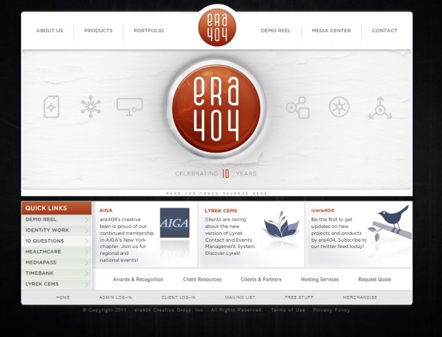
After 10-years and a response to the new branding campaign for era404 Creative Group (read the press release here), we’ve finally relaunched our site to promote the new identity and better feature our newer work. The site will continue to be updated for the next few months, as we finish cutting our new demo reel and enhance our product offerings, but we felt it necessary to update the interface in the meantime to show the complete embrace of our new identity and updated mission.
Book Trailer: ROOM, by Emma Donoghue
My company, ERA404 Creative Group, just finished editing this book trailer for the new novel by Emma Donoghue, “ROOM.” The book has already been shortlisted for the 2010 Man Booker Prize and has received a ton of wonderful publicity. This video was shot in the client’s audio lab at Little, Brown and Company. The actor is the son of publisher Michael Pietsch and is actually a very good artist. Coaching a little kid to draw poorly is more difficult than it sounds, but he did a wonderful job anyway.
While I selected the script, edited the audio and directed the shoot, the editing and cinematography was done by Mike Citarella and the video was shot under the guidance and creative assistance of LBC Marketing Maven (and Craft Services for the shoot), Amanda Tobier. The official site for ROOM (www.roomthebook.com) is expected to launch next week.
This is the third video we’ve concepted for a book. The first was the viral video (NSFW) for Charles Bock’s “Beautiful Children,” which rocketed through the web with the help of Adrants and Gawker articles. The second was for Joshua Ferris’s “The Unnamed” web site, which showcases surveillance video from Grand Central Terminal.
Opera Logo with CSS

I found this hilarious. Special thanks to Fischsticks for pointing it to my attention.


