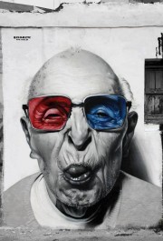
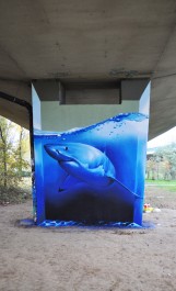
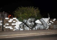
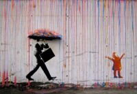
Mike found a link on Street Art Utopia, which recently posted the 106 best street art photos of 2013. This gallery shows my favorites, but the site is a wealth of artistic and clever pieces. Take a moment to peruse their gallery to see that there’s more in the world of street art than just Banksy.
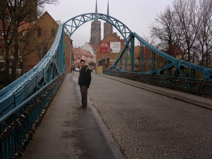
Tumski Most
Liu Xue’s Humanimal Sculptures
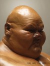
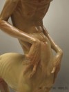
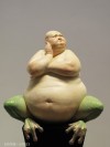
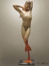
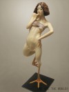
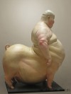
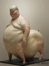
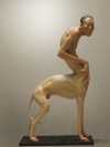
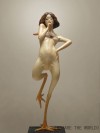
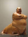
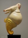
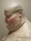
Chinese Sculpter Liu Xue created a beautiful series of human-animal hybrids that he calls “We Are The World.” Most feature obese caricatures of bald men supported under the legs of walruses, bull frogs and pigs. Others include lithe contortionists with bird legs, and a wispy crooked man shrugging over a poised greyhound body.
The entire set of 63 photos is here, and I’ve included my favorite shots above.
Return to Temple Bar
In June of 2005, I enjoyed a Black and Black (Guinness with two shots of espresso) at Temple Bar in Temple Bar—Dublin’s much older version of NYC’s Greenwich Village, riddled with tourists and students from the nearby Trinity University, which is, in turn, Dublin’s version of the much older NYU. The final swig of the drink was captured digitally by Mike, and somehow made it’s way to NewsToday and QBN design forums and their insidious PSBs.
Two weeks ago, I returned to Temple Bar and Mike thought it would be fun to recreate the photo from 8.5 years before. Above are the two pictures side-by-side. Below is an animated gif created by Google Plus’s “auto-awesome” feature. In all three photos, I’m in dire need of a good shave and notice my default wardrobe (V-neck black T-shirt) hasn’t changed much over the decade:
ERA404 Favicon / App Icon Generator
Fore-Edge Paintings in 19th Century Books
Fore-edge painting, which is believed to date back as early as the 1650s, is a way of hiding a painting on the edge of a book so that it can only be seen when the pages are fanned out. There are even books that have double fore-edge paintings, where a different image can be seen by flipping the book over and fanning the pages in the opposite direction.
(via This is Colossal)
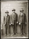
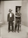
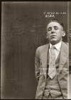
1920s Mugshots
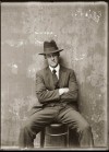
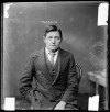
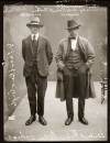
Originally, I thought these were the headshots for the Mad Men casting call, but their clothes didn’t match the era. Then I was wondering if everyone in the 1920s looks like a movie star (Ralph Fiennes, Peter Sarsgaard, Dennis Quaid, Ron Perlman, Richard Jenkins, etc.).
