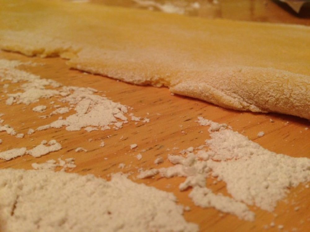
This Christmas, I got a pasta maker. I’ve gained 10 lbs. Read more
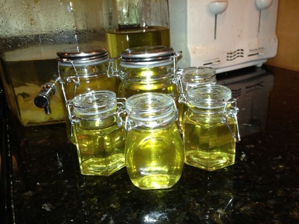
Making Limoncello
In the past, I’d had a few more DIY photologs (Making Linguini, Making a Server, Making a Closet, Making a Patio, Making a Genovese) and thought it was about time that I put a new one online.
Anywhere you go in Campania, you’ll see Limoncello. And after having spent a month in Italy with my extended family, my love of the digestif led me to seek it out upon returning to NYC. While my Italian comprehension skills were quite bad back then, and I’d already consumed a number of glasses of the 32% alcohol, I seem to remember my cousin, Donato, telling me it was a family tradition to make their own. It’s the second most popular liqueur in Italy and infused rampantly throughout the Amalfi Coast—where my family original settled.So, naturally, I thought it’d be fun to make my own. Read more
Takahiro Iwasaki
Japanese artist Takahiro Iwasaki creates sculptures from the unexpected materials like electrical tapes, toothbrush bristles or towels. His recent works like “Floating Reflected Temples” (below) made of Japanese cypress exhibited on The 7th Asia Pacific Triennial of Contemporary Art.
Victoria Peak (a mountain in Hong Kong) on a roll of vinyl electrical tape by the artist Takahiro Iwasaki. Read more
NYC’s East Side Access Tunnels
There is a 22-foot-long, 200-ton steel monster under Manhattan. Dead, resting deep somewhere under Grand Central Station and Park Avenue, this machine and her twin brother excavated the massive tunnels that you can see here, one of the largest public transportation works of our time.
Here’s an impressive new look at the amazing tunnels and caverns of the East Side Access, an extension of the Long Island Rail Road. Read more
It’s ugly so it doesn’t work.
The Thickness of Napkins
“What does a napkin tell you about a restaurant? Quite a lot. A restauranteur friend told me about a survey that showed a massive correlation between category of napkin and customer satisfaction. That’s not to say you can hand out deliciously thick napkins in a shitty burger joint and immediately win customers over. It’s a cause and effect thing. The napkin represents a degree of care, preparation and devotion that goes above and beyond asking if they want fries with that.”
This brief, but poignant article by Des Traynor, COO at Intercom, reminded me of a lesson I learned in developing Lyrek CEMS for the Fashion & PR industries back in 2007.
I sat down during a training session with a woman that ran the PR for many industrious fashion designers and started walking her though the product, then called Reserve-U. Her response:
“It doesn’t work.”
I rebutted with confidence that the product had been thoroughly tested and I assured her there were no bugs in the system.
“You don’t understand,” she said. “It’s ugly, so it doesn’t work.”
Read the rest of the article on ERA404’s web site, here:
http://www.era404.com/press/building-a-better-mouse-trap/
Read the rest of “The Thickness of Napkins” on Contrast:
http://www.contrast.ie/blog/the-thickness-of-napkins/
(via @raf)
Christopher Jonassen’s Alien Landscapes
Is it the surface of the Mars or Venus or an undiscovered planet? Not at all. These pictures aren’t what you think they are. Christopher Jonassen, a Norwegian photographer shot these beautiful and otherworldly series called ‘Devour of frying pan bottoms’, which are visually similar to craters and scars on a planet’s surface. In his series Jonassen refers to a quote of Jean-Paul Satre who said: ‘To eat is to appropriate destruction’ and the meaning of the word ‘devour’, which stands for eating up greedily, destroying, consuming, and wasting.
Twitter Cards
If you’re an avid user of Twitter, you’ve probably noticed the new links that show up on the bottom of certain tweets in your feed. The links say “View Summary” and allow you to read the title and excerpt of an article, along with a thumbnail of the article’s featured image. Those links are called Twitter Cards, come in three different varieties: summaries, photos, and play, and have two different layouts: web and mobile.
Twitter Cards help increase your visibility and ensourage users to click to your site by providing more information beyond Twitter’s 140 character limit. Furthermore, design and development studios with Twitter Card functionality built into their site can provide a working example for clients to see how the same functionality can be implemented into their sites.
As with most of Twitter’s APIs, Twitter cards are fairly quick to implement. All you need to do is insert some metadata, test, and apply to participate. To make things even easier, Niall Kennedy has created a WordPress plug-in to automatically scrape your post’s title, permalink, description and image URL for summary Twitter cards. After installing and activating the plug-in, preview your Twitter card by pasting the post’s URL into their preview page.Lastly, you’ll need to apply to participate. Simply enter your site and contact information here and Twitter will reply within 5-10 business days.