Italian graphic designer Emanuele Abrate has come up with an interesting project titled ‘Who Designed it?’, in which he substitutes wordmarks of famous logos with the names of the designers and agencies who created them.
apple
Things Come Apart
Things Come Apart is an expansion of the original Disassembly Series, by Todd McLellan. This new set of images explores retro to modern daily items that have, are, or will be in our everyday lives. The book “Things Come Apart” published by Thames & Hudson will be available May. Read more
Don’t Upgrade QuickBooks
 I’ve been using QuickBooks for my businesses for about a decade now (and Quicken, for personal finances, since Microsoft Money closed-up shop in 2009). It is single-handedly the ugliest, worst designed and most unintuitive piece of software that I’ve ever used, but it works. It does what it needs to do. So I simply: take notes on where I need to re-locate those elusive little features that intuitively should be located in different places, squint my eyes and try to ignore the antiquated icons, the poorly conceived aesthetic and grid, and the painfully amateur process flow and organization of the product.
QuickBooks had been bad since before Money went south, and still it found a way to best Microsoft. Now, with no real competition in the well-designed corporate financial applications sector (other than Intacct Winter, Sage 50 Pro Accounting, FreshBooks, Mint, Quosal, Concur Expense, Xactly Incent Express, etc.), Intuit can keep on unabashedly releasing terrible software. But I digress.
I’ve been using QuickBooks 2009 through last month, when I received a notification that they would no longer be supporting the QuickBooks Email feature for older versions. It’s a free feature that allows me to easily and quickly provide digital copies of invoices and statements to clients. In fact, it was the only intuitive process they had in the whole application: You simply log-in to QuickBooks, browse to the invoice or statement and click “Send” and it’ll prepopulate an email to the client, print a PDF of the document, attach and send. The notification detailed that they wanted to focus on providing this feature to more current customers/versions and that I needed to upgrade in order to use the service.
After receiving the notification, I debated with my accountant the point of upgrading to QuickBooks 2012. I’d already memorized the quixotic process flow and figured out their capricious organization. If the only issue I was having with the software was the QuickBooks Email feature, why upgrade? A new copy of 2012 is only $200-400, he said, and it’s always good to have a current version of the software. (I, who am perpetually annoyed at Apple foisting upgrades to their bazillion little helper apps, am inclined to disagree). But I relented and spent $185.00 on the upgrade.
After installing and upgrading my corporate files, I finally got around to sending a client an overdue invoice. I click the “Send” button and I see the following message: “QuickBooks Email is only available to customers who have monthly subscriptions to the following online Intuit applications…” And despite being conned into spending almost $200 on a new version of QuickBooks, subscribing to a monthly payroll service provided by Intuit (which isn’t one of those required online Intuit applications) and being able to have the QuickBooks Email service for free for the past decade of loyal patronage, I still couldn’t use this feature.
I contacted tech support. They sent me an email providing a link to their help home page and closed the ticket. I called customer care. They passed me around to 7 different representatives (I’m not kidding, SEVEN!) where I had to provide my name, my phone number, my company name, my email address, my QuickBooks License number, my QuickBooks customer number — all in painfully slow monotone, repeated 2-3 times to confirm. After 4 hours of being on the phone, here’s what I learned:
While this feature used to be free, it is no longer free and would only be provided to customers with monthly subscriptions now (read: their highest paying customers).
I hung up the phone in a rage. Naturally, the representatives didn’t bother to ask me to complete a survey.
 Intuit is simply following in the footsteps of Geni.com, Spotify, and all those other greedy corporations out there that have decided that gradually stripping away features to squeeze more money out of customers is a strong business ethic. It isn’t the first time they’ve done it, either. On May 15, 2011, Intuit sent a note to their customers informing them that QuickBooks Document Management will no longer be included in QuickBooks, starting with version 2011 (click the image for details). Why?
“A change in our accounting policies requires us to stop offering free services in any version of QuickBooks after 2011.”
If these are the ethics that QuickBooks uses in treating their loyal paying customers, I am beginning to wonder about my own ethical policies. Why should I continue to give money to a corporation that is seemingly turning this practice into a business model?
In the meantime, I’ve found a work-around for the QuickBooks Email issue where I can send invoices using an external SMTP server. This feature wasn’t available in QuickBooks 2009 because it wasn’t needed when the email feature was free. Again, it’s in a hidden, convoluted location in the software.
If you find yourself in the same predicament and need assistance setting up the QuickBooks Webmail feature for Invoices and Statements, drop me a line. Or leave a comment if you’re irritated by Intuit’s practice or have an equally frustrating story to share.
myPANTONE for the iPhone

I don’t have an iPhone. And if you know anything about me, you probably know that I would never really want one. I’m on my phone too much as it is and can’t imagine creating a situation where I’d want to be on it more. I’m happy with my HTC TouchPro (though I wish it had a longer battery life) and find 99.9% of the applications that I’ve seen on the iPhone to be worthless; along with the animations, bells & whistles of the phone itself.
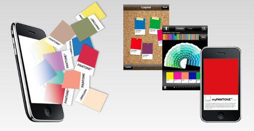
However, that said, I really find the myPANTONE app to be incredible. Take a look at this list of features:
Get your color inspiration and create your color scheme from these PANTONE color system libraries:
- PANTONE MATCHING SYSTEM® (coated, uncoated and matte)
- PANTONE Goe™ (coated and uncoated)
- PANTONE Pastels (coated and uncoated)
- PANTONE FASHION + HOME (paper and cotton)
- Includes sRGB, HTML and L*a*b* for all colors
You can capture and extract colors from photos and snap to the closest PANTONE Color:
- Images loaded on your iPhone
- Directly from images taken by your iPhone camera
Automatically generates harmonious color combinations
Cross-reference PANTONE colors to other PANTONE color libraries
Once you have created your color palettes you can then share them in a variety of ways:
- E-mail an HTML image of your palette
- E-mail color palettes that can be used in the Adobe® Creative Suite® (.ase files), QuarkXPress® and CorelDraw®
- Upload to the myPANTONE.com palette sharing web site
Other features include:
- Text and voice annotation of palettes
- Post notifications of new palettes to Twitter and Facebook
- GPS tagging of palettes
There’s a video tour by Glenn Fleischman on YouTube and Pantone.com. And I imagine each new version will allow designers to perform more useful and intuitive tasks. And I’m not just saying this because we built the Facebook app, either.
The only other application that I would consider to be as helpful, if my meager testing of it proved it even worked, would be the What The Font app by MyFonts.com. I don’t know if it’s the iPhone’s crappy camera or the application’s poor calibration—the application on their site also seems lacking as of late—but I couldn’t get it to suggest fonts even mildly similar to the one I was seeking.
Apple gives up…sorta
Over a year ago, I posted about ZDNet’s 10 Most Annoying Programs on the Internet, where Apple was ranked #2, forcing users to install Quicktime with each upgrade of iTunes and also pre-selecting that the user wanted to install Safari and Mobile.me onto their computers as well. I’m a strategic marketer, so I understand the logic behind it. More than half of the users probably just click “Continue” without reading what they’re installing. It’s the same guiding principle behind bundling installers with Yahoo! and Google browser toolbars. Read more


