God I really, REALLY wish they seized this opportunity to get rid of Continental’s dated globe icon. It looks like all they did was change the font to a Gothic face and call it a day. What a waste of a great chance to reinvent themselves.
design
Our Ten-Year Anniversary
 Two weeks ago, I turned 32-years-old. I’ve barely come to terms with the fact that half my life ago, I already owned a driver’s license and could legally drive in the State of Michigan. And now I’ve come to realize that next week marks the 10-year anniversary (the “tin” anniversary) of the date I threw everything into a U-haul and moved to New York City. Within the span of a week, I accepted a dot-com job offer, graduated from college, said goodbye to my friends and family, drove through the night and slept in a truck on the streets of Polish Brooklyn until I leased an apartment and began my new job days later. It was exactly 800 miles from my alma mater, five states away from the rest of my family and the longest week of my life.
Three years ago, I wrote a list of accomplishments to mark my 29th birthday. I won’t do that today as I’m afraid the undoing of some of those milestones would only depress me. And today isn’t a day to contemplate my own achievements, but rather to reflect on what New York City has done for me in the past decade. Read more
Duane Reade’s New York Packaging

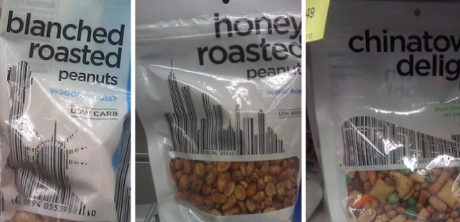
It isn’t the first time people have incorporated bar codes into the design of things. In fact, I believe I saw three different periodical covers last year that used this same technique. So the concept is far from original.
But Duane Reade—which, to New Yorkers, is synonymous with pharmacy—recently took this one step further by working their product bar codes into iconic metropolitan imagery. The Chinatown Delight—which I always thought was either a extra surprise at the end of a massage, or the revelation that she’s both my daughter and my sister (Don’t get my reference? Then forget it, Jake, it’s Chinatown)—uses a subway train. The Honey Roasted Peanuts uses a NYC cityscape. The Blanched Roasted Peanuts uses the Statue of Liberty. So while the imagery and concept are New York at it’s tritest, the integration of both the bar code and symbolism into the main graphic elements on this packaging makes it pretty unique and beautiful.
I Love Dust
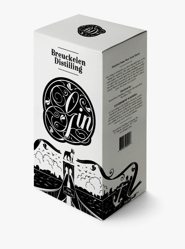
I really enjoy the product design work by I Love Dust. Take a look at the packaging for Breuckelen Distilling, a Brooklyn-based distillery, below.

Overdue Casualties of the Recession
Over the last year, a lot of the way we promote ourselves has changed. The latest casualty in this transition is Creative Hotlist, a paid service provided by Communication Arts.
As you probably remember from previous posts, I’ve whittled my periodical subscriptions from six down to two: HOW and Step Inside Design. Other than the recession itself, there are numerous reasons for this decision. Ultimately the choice was made based on one simple word: value. Read more


