This past weekend, on a trip to see my girlfriend’s family for Father’s Day, my phone was stolen. Or lost, perhaps. I really don’t know how it came to be out of my possession, but it really doesn’t change the fact that I was without a phone. In truth, I’d planned on upgrading my Apple iPhone 5, anyway, as I’d been out of contract for a few months. However, despite the manufacturer’s planned obsolescence and my excitement for new-fangled gadgetry, I still couldn’t see myself upgrading unless I absolutely needed to. I despise contributing to the e-waste problem and conspicuous consumption and teetered on the fence between keeping the phone and turning it in to AT&T for a paltry exchange payment. Read more
iphone
Increasing iOS 7 Battery Life
Since upgrading to iOS 7, my iPhone 5’s battery life has suffered. So I decided to poke around to see what I could do to help ensure I get the most from each charge. Here are some of the things I’ve learned, which were culled from Maclife.com.
Mobile Websites vs. Applications
There’s no denying that mobile phones have grown to become an increasing part of our lives. In fact, there’s a 42% likelihood that you’re reading this newsletter on your phone or tablet device, up 10% from last March. And in most cases, mobile applications would probably be overkill for your business or brand, where a beautifully designed, responsive newsletter (such as this one) will more than suffice. However, if you’re looking for something more than emails, here are some things for you to consider.
There’s a big difference between a mobile website and a mobile application. Before you can evaluate the benefits of either, it’s important to understand the key differences between the two. Both apps and mobile websites are accessed on a handheld devices such as smartphones (e.g. iPhone, Android and Blackberry) and tablets.
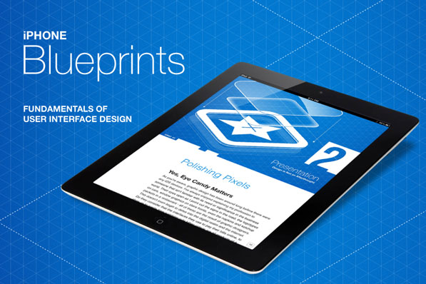
iPhone Blueprints: Fundamentals of User Interface Design
iPhone Blueprints is a new book by Scott Jensen that covers User Interface Design and its importance. In the book, Scott deals with everything needed to create an effective user interface. Most of the books that are available on the subject are typically full of design patterns with tons of theory and very little actual usable information. iPhone Blueprints [iBookstore link] is being featured here because it looks spectacular on the iPad and is one of the best guide books on UI design for the iPhone in existence today. The author currently works at Ender Labs that brought us the lovely music player app Track 8.
Everything from the book cover to the chapter mastheads in this book is drool-worthy. The book is split up into 9 main sections. The introduction deals with why UI is important and the author then goes on to discuss who makes a good designer by drawing some brilliant examples. I love the emphasis on why UI and UX go together.
“If you’re a UI designer, you should be making UX decisions. Otherwise, you’re a decorator, nothing more.”
Original article on BeautifulPixels.com
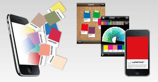
myPANTONE for the iPhone

I don’t have an iPhone. And if you know anything about me, you probably know that I would never really want one. I’m on my phone too much as it is and can’t imagine creating a situation where I’d want to be on it more. I’m happy with my HTC TouchPro (though I wish it had a longer battery life) and find 99.9% of the applications that I’ve seen on the iPhone to be worthless; along with the animations, bells & whistles of the phone itself.
However, that said, I really find the myPANTONE app to be incredible. Take a look at this list of features:
Get your color inspiration and create your color scheme from these PANTONE color system libraries:
- PANTONE MATCHING SYSTEM® (coated, uncoated and matte)
- PANTONE Goe™ (coated and uncoated)
- PANTONE Pastels (coated and uncoated)
- PANTONE FASHION + HOME (paper and cotton)
- Includes sRGB, HTML and L*a*b* for all colors
You can capture and extract colors from photos and snap to the closest PANTONE Color:
- Images loaded on your iPhone
- Directly from images taken by your iPhone camera
Automatically generates harmonious color combinations
Cross-reference PANTONE colors to other PANTONE color libraries
Once you have created your color palettes you can then share them in a variety of ways:
- E-mail an HTML image of your palette
- E-mail color palettes that can be used in the Adobe® Creative Suite® (.ase files), QuarkXPress® and CorelDraw®
- Upload to the myPANTONE.com palette sharing web site
Other features include:
- Text and voice annotation of palettes
- Post notifications of new palettes to Twitter and Facebook
- GPS tagging of palettes
There’s a video tour by Glenn Fleischman on YouTube and Pantone.com. And I imagine each new version will allow designers to perform more useful and intuitive tasks. And I’m not just saying this because we built the Facebook app, either.
The only other application that I would consider to be as helpful, if my meager testing of it proved it even worked, would be the What The Font app by MyFonts.com. I don’t know if it’s the iPhone’s crappy camera or the application’s poor calibration—the application on their site also seems lacking as of late—but I couldn’t get it to suggest fonts even mildly similar to the one I was seeking.


