If you haven’t already checked it out, the Pantone Moods Facebook application that was conceived and created by ERA404, has a history and trends tab. The trends tab shows current mood matches, based on color, mood blurb, gender, date/time of submission, and distance from you. It also compares your current mood color and blurb based on gender, location, color match, word match, and frequency. Lastly, it shows global mood trends with the most active gender (female) and color (21-1-7 C), most active location (São Paulo) and color (21-1-7 C), most popular color now (1-1-6 C) and of all time (21-1-7 C), and most popular words (color, blue, feeling, today, happy) and colors (21-1-7 C, 76-1-7 C, 1-1-6 C, 132-1-4 C).
Read more
Design
Atlas of True Names
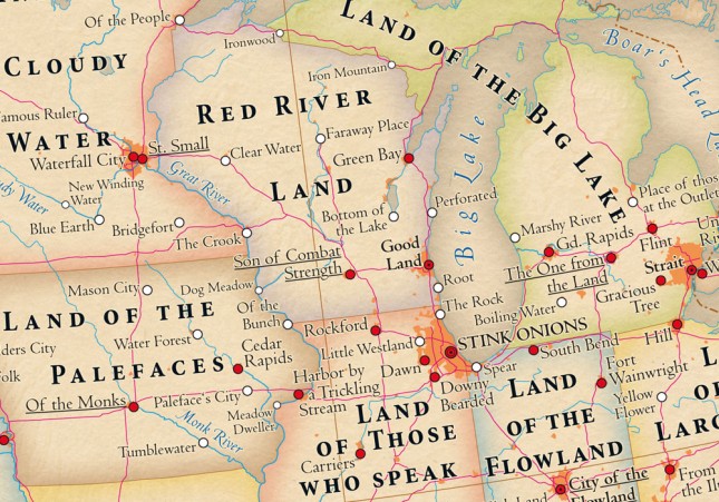
I was delighted to see that my hometown, Kalamazoo (“Boiling Water”), made its way onto The Atlas of True Names. Read more
The History of Typography
httpv://www.youtube.com/watch?v=wOgIkxAfJsk
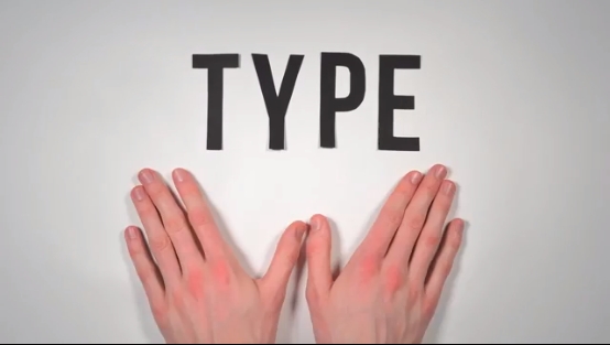
A paper-letter animation about the history of fonts and typography. 291 Paper Letters. 2,454 Photographs. 140 hours of work.
True Colors, Branded Colors
After posting Color Psychology in Logo Design last week, I became more curious about how my studio‘s branding might be triggering different psychologies in clients. I wondered if it they’re sending out messages that might be perceived differently by men or women (see “You Work For Her”), and different cultures in different parts of the world. Read more
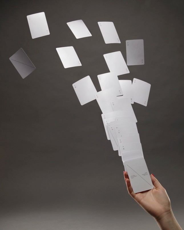
Minimalist Iota Playing Cards, by Joe Doucet
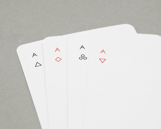
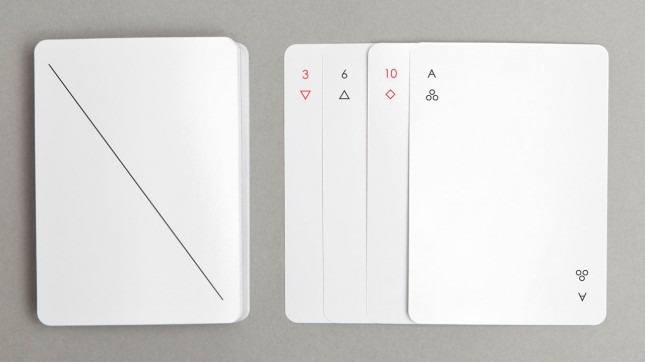
IOTA is a deck of regulation playing cards by Joe Doucet that dallies with the idea: how much you can take away while still maintaining a playable deck? Simple geometric symbols are reductive versions of hearts, clubs, diamonds and spades. While it’s necessary to mark the back of regulation playing cards, Joe’s done so with a minimal diagonal line instead of the overly ornamental versions used at your granny’s bridge club.
Original Post on Design-Milk
(via @Greedo)
Color Psychology in Logo Design
In this infographic by Muse Design, which has a curious mix of “color” and “colour” (homogenized below for your convenience), the designer provides some color commentary (so to speak) as to what colors consciously and subconsciously say: Read more
Underpantones
Personally, I think it’s a good idea they didn’t decide to name the product: PMS Underwear. From the manufacturer web site:
“Suddenly, the Pantone brand is everywhere. Overuse? Maybe. But, as they say, if you can’t beat ‘em… so, over a few beers, we decided to add to the products on offer. Ladies and gentlemen, for him and for her, we present underpantones (and, of course, pantytones)! If we had our way it’s what every well-dressed designer would be wearing.”
(via Gret)